A Guide to Colour Theory for Interior Design
Your colour scheme is one of the most important decisions you will make in an interior design project. Without a harmonious palette, it won’t matter how much time, money or care was put into the furnishing, lighting and accessories – something will still look ‘off’. With 1000s of shades to choose from where do you start, and what do you need to know about colour theory for interior design to create a sophisticated and inviting atmosphere aligned with your vision? We’re here to help guide you in a basic understanding of Colour Theory, so you can bring your ideas to life, without the risk of colour mishaps.
This guide has been designed to help you understand how to use colour theory in interior design, and understand colour terminology and colour harmonies to elevate your next interior design project to a work of art. Packed with expert tips from our team of award-winning designers this is everything you need to get started planning your next colour palette.
Jump to:
- What is colour theory
- Understanding the colour wheel
- Colour terminology
- How to apply colour theory in interior design
- The 8 colour harmonies
- Warm and cool colours
- How colour combinations impact a space
- Colour psychology in interior design
- How colour affects the perception of space
- Benefits of working with an interior designer
- Award-Winning Interior Design, London UK
What is colour theory?
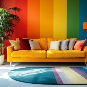
Colour Theory is the art of partnering complimentary colours to create a ‘colour harmony’. Colour harmonies are crucial to ensuring any design – interior, art or graphic – sings, without feeling off-key. Using Colour Theory at the start of your interior design project lays strong foundations for your room, so you’ll be excited for the end result. To master Colour Theory, you need to be familiar with the colour wheel.
Understanding the colour wheel
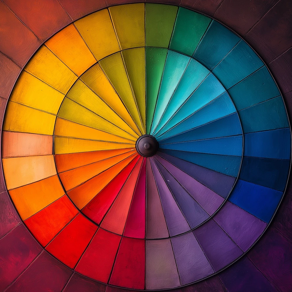
Chances are you recognise the colour wheel. It was first published by Isaac Newton when he passed white light through a prism, splitting the colours into a visible circle.
The wheel, which shows a colour’s relationship to another, is used by interior designers, artists and graphic designers to create complimentary colour schemes. There are now two colour wheels:
Traditional Colour Theory recognises a red-yellow-blue (RYB) wheel, commonly used by artists and designers, due to its relevance in paint mixing.
Alongside this, the red-green-blue (RGB) wheel has become common (arguably, more so), and is used for digital designs, including online and television, as it mixes light.
For the purpose of this blog, we’ve referenced Colour Theory in relation to the original RYB wheel.
Primary, Secondary and Tertiary colours
An RYB colour wheel consists of twelve colours: three primaries, three secondaries and six tertiaries.

Primary colours: The primary colours red, yellow and blue are defined as ‘pure’ or ‘parent’ colours, they cannot be created by blending other colours and sit equidistantly from each other on the wheel.
Secondary colours: The secondary colours are produced when combining two primaries. In a RYB Wheel, these are orange, green and purple. They’re also equally spaced, sitting between their primary partners, with a tertiary on either side.
Tertiary colours: Finally, tertiary colours sit beside a secondary colour. They are created by mixing secondaries – red-purple (magenta), yellow-orange (amber) and blue-green (teal).

If you try mixing a secondary and primary, you’ll likely get a brown colour. Not that we’re opposed to this – Pantone’s Colour of the Year 2025 is Mocha Mousse a luxurious brown – which we think is a divine colour in any home!
Colour terminology: Creating colour combinations that work
The colour wheel offers us 12 choices, but anyone who’s been paint shopping knows the reality is an endless array of options. You have hues, shades, tints and tones to thank for that!
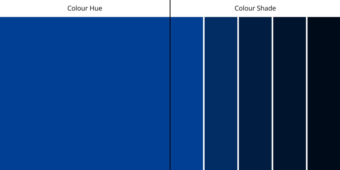
- Hue: A colour at full saturation. A hue refers to an unaltered form of a colour, meaning no black or white is added. All 12 of those in a wheel are hues.
- Shade: Adding black to a colour. Although the word is commonly used interchangeably with ‘colour’, in Colour Theory, ‘shade’ refers to the mixing of black with its hue. A shade is always darker than the hue (e.g. blue to navy).
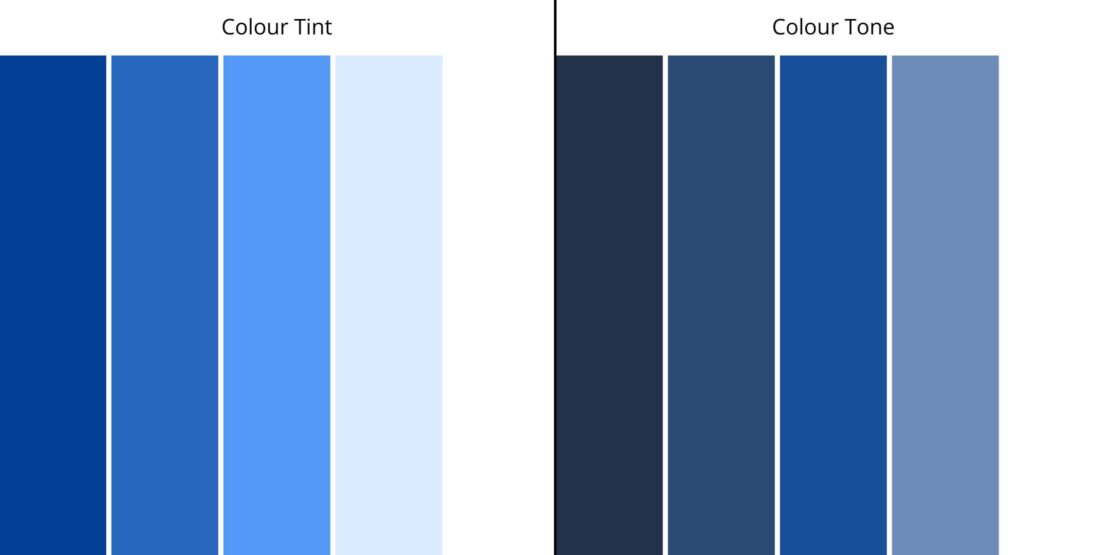
- Tint: Adding white to a colour. In contrast to shades, tints are created by adding white to a hue, creating a lighter variation (e.g. blue to sky blue).
- Tone: Adding grey to a colour. Tones are produced by mixing differing amounts of white and black (grey) to a hue. This has a dulling effect, creating a natural, stone-like colour.
How to apply colour theory in interior design
We’ve explored the colour wheel and primary, secondary and tertiary colours, and understand how to create hues, shades, tints and tones. So, how do we use Colour Theory in interior design?
Knowing how colours work together ensures the result of any room reflects your desired effect. Ever looked at something and thought, “this just doesn’t look right”? Chances are, the colours clash (even if only subtly). Starting with Colour Theory reduces the chances of this happening.
Our award-winning interior designers apply Colour Theory to all our projects, working closely with our clients to understand the effect they want to achieve within a room, and then applying theory to bring it to life in a harmonious way. Which brings us to colour harmonies.
Interior design and colour harmonies
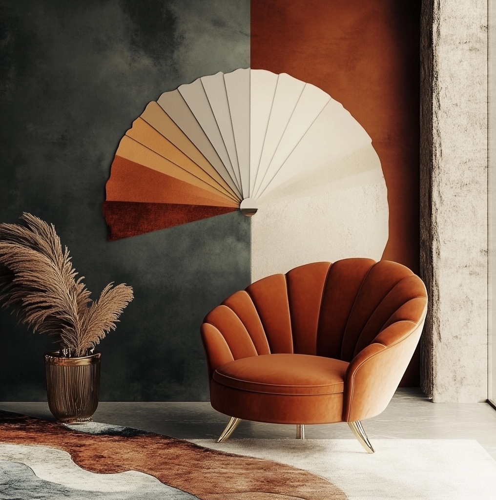
Colour harmonies turn your dream mood into a reality, but colour pairing is an art. The simplest switch in shade, tint or tone can alter the mood of a room. Partnering dark shades with bright hues, for example, can make hues look brighter. It can boost the mood of a social space – a worthy consideration when designing your dining room.
For a more organic feel, incorporating warm and cool tones into your living room design can emulate a calm and cosy vibe (and make it look larger).
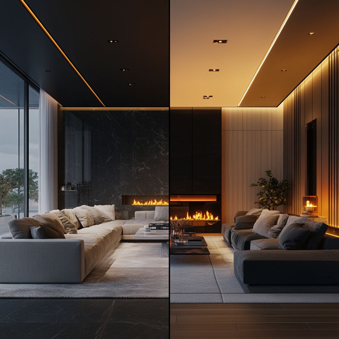
It’s also worth noting at this stage that considering all the uses and therefore differing ambiences you wish to create in a room is important. Does it need to be bright and open in the daytime, but cosier and warmer in the evening? Consider how natural light versus artificial light will affect the colours. Working with an interior designer here can really help you, as experts in colour theory and with extensive real-world experience, they can help you refine your colour palette from good to exceptional.
What are the 8 colour harmonies?
Interior designers often work with one of eight colour harmonies, using them to combine colours that work cohesively together to create a pleasing palette.
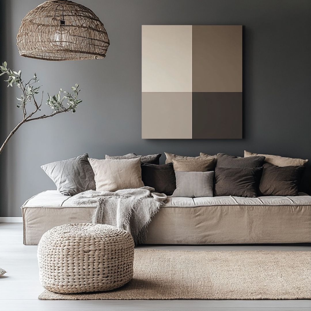
- Achromatic: Uses black, white, and variations of grey.
- Monochromatic: Different shades, tones and tints of the same colour
- Analogous: 3 colours next to each other on a colour wheel
- Complimentary: Opposite colours on the colour wheel
- Split complementary: Instead of just 2 opposite colours, split complementary uses two opposite colours on each side of the opposite colour
- Triad: 3 colours equally spaced apart on the colour wheel
- Tetrad: Uses four pairs of complementary colours
- Square: Uses four colours, comprising two complementary pairs but will always include one primary, one secondary and two tertiary colours.
Let’s dive into each one in a little more detail
Achromatic
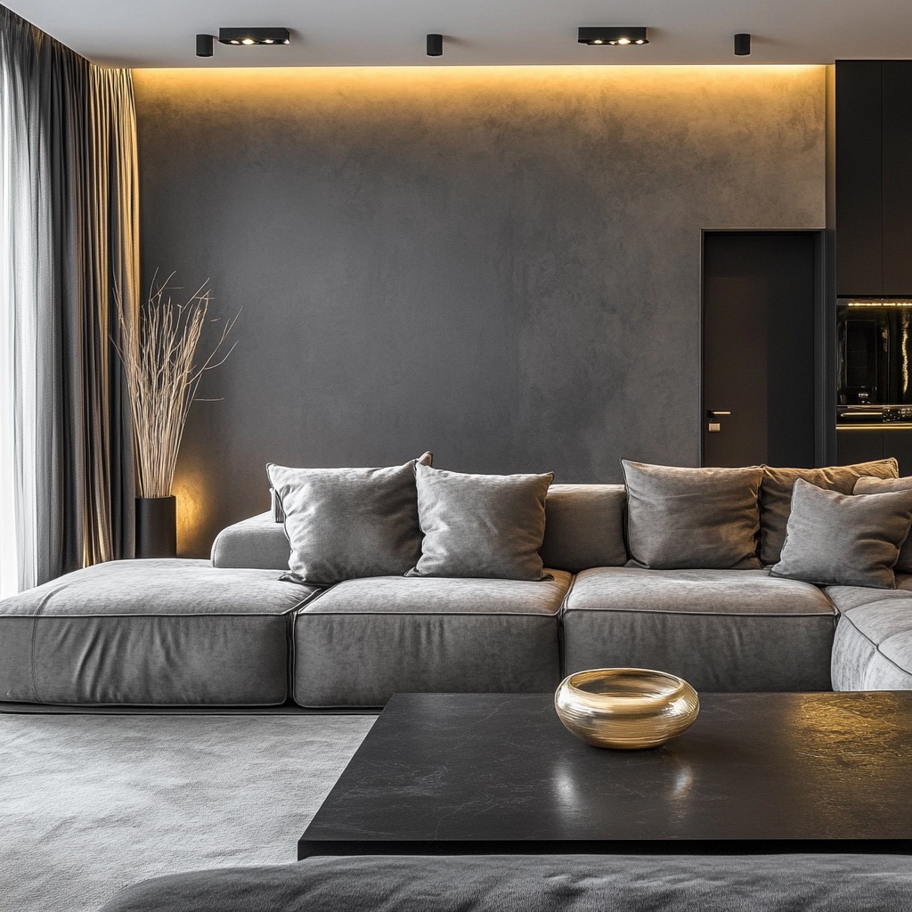
An achromatic colour harmony is the rebel of the group! It can’t be shown on a colour wheel as it only uses black, white, and variations of grey. You might have heard this palette termed ‘monochromatic’, which is technically incorrect, as we explain below.
Benefits of an achromatic colour palette: It’s a good choice for bringing a sense of formality to a space and encouraging focus.
Monochromatic
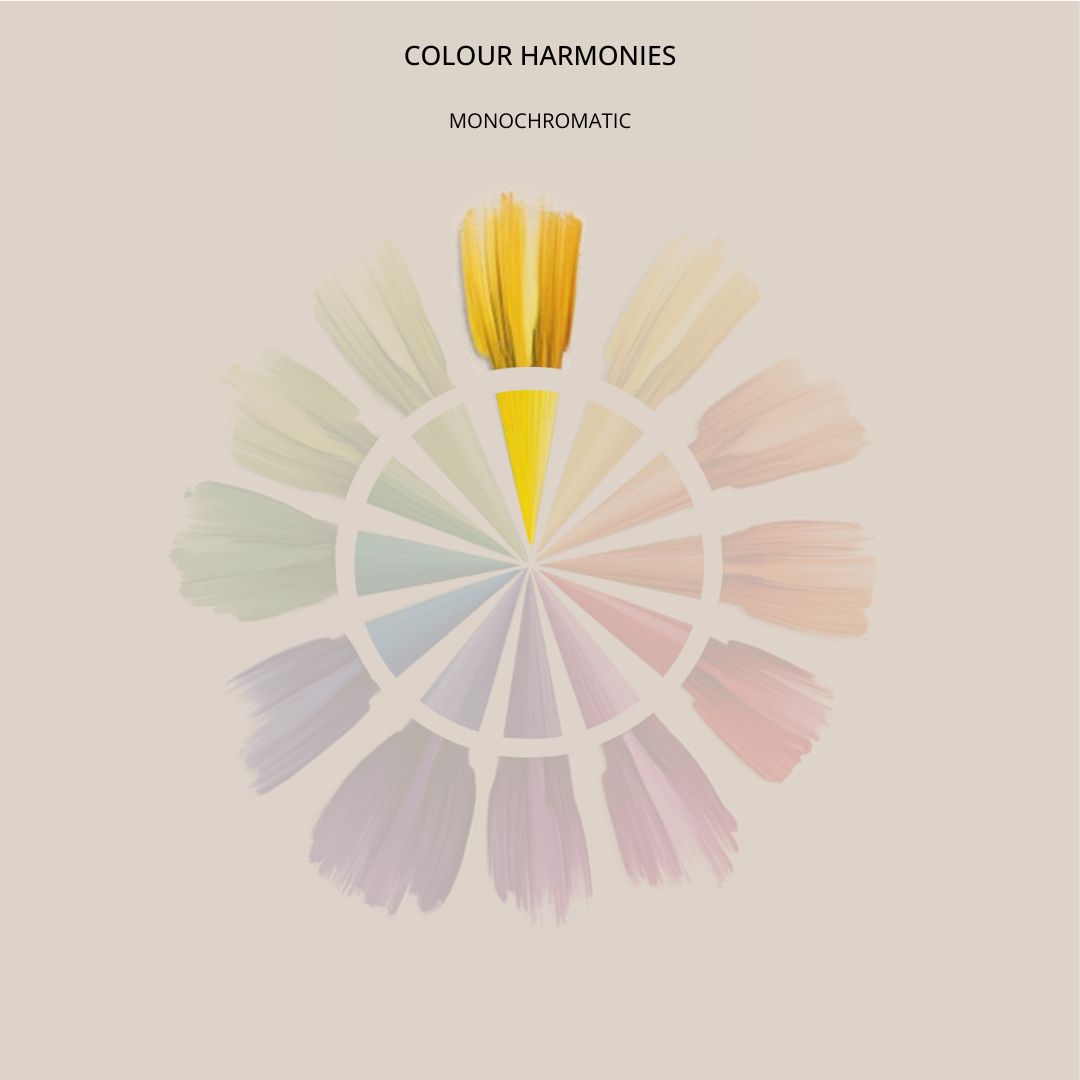
A monochromatic colour harmony encompasses more than black, white and grey, referring instead to a palette created using gradients from a single colour.
It’s known to evoke feelings of tranquillity and zen, bringing a sense of calm to spaces like bedrooms.
Analogous
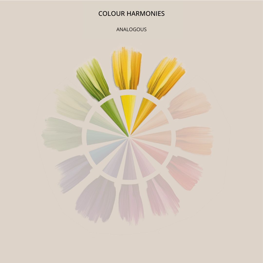
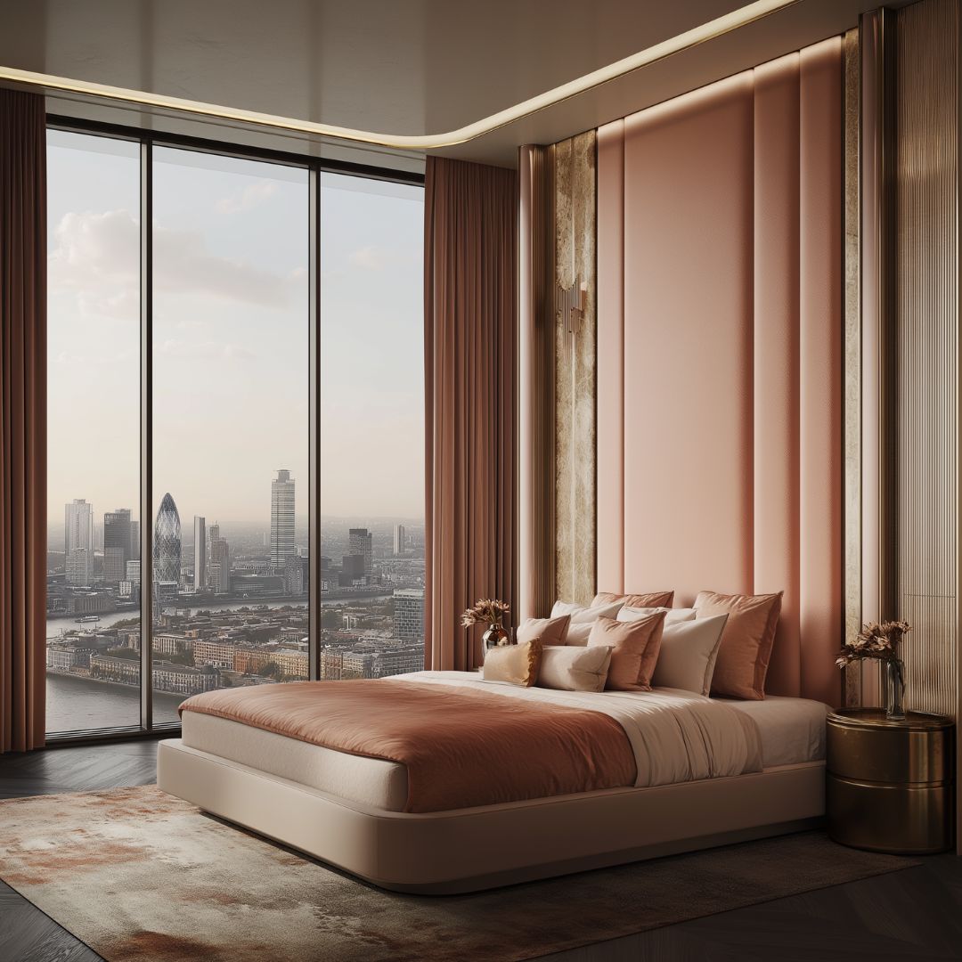
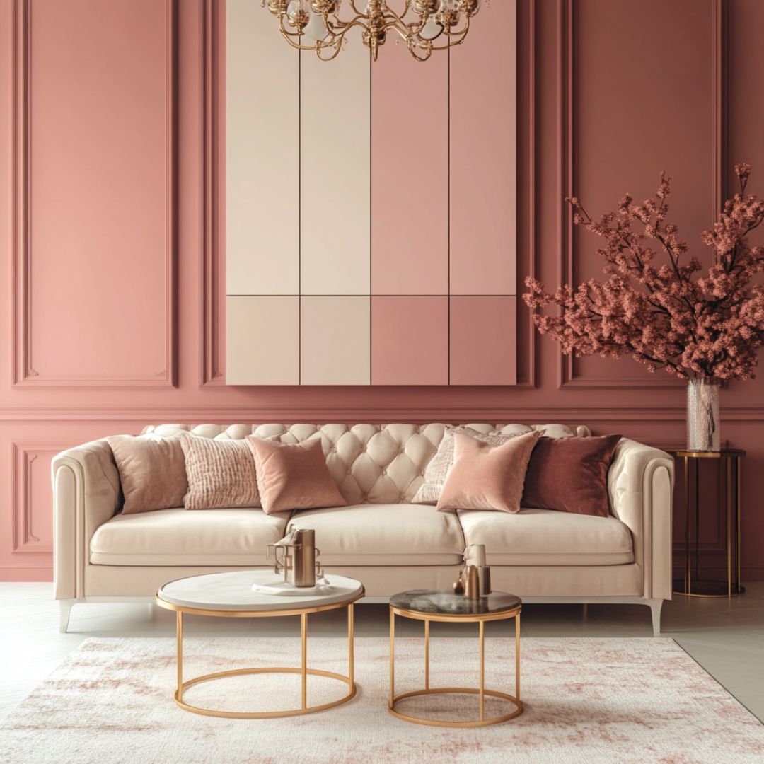
Analogous colour harmonies are created by combining three colours that sit alongside each other in the colour wheel.
An analogous palette will always include one primary, one secondary and one tertiary colour, and is well balanced in its nature.
Complementary

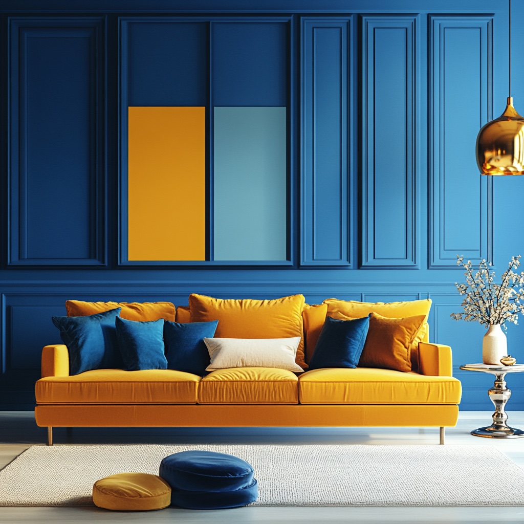
A complementary colour harmony uses two colours sitting directly opposite each other on the wheel.
This means you’ll only ever work with a pair of primary, secondary or tertiary colours – never a mix across groups.
Opposing colours are highly contrasting, particularly when paired at full saturation. So, it’s a statement choice if you’re after a bold look.
Split complementary
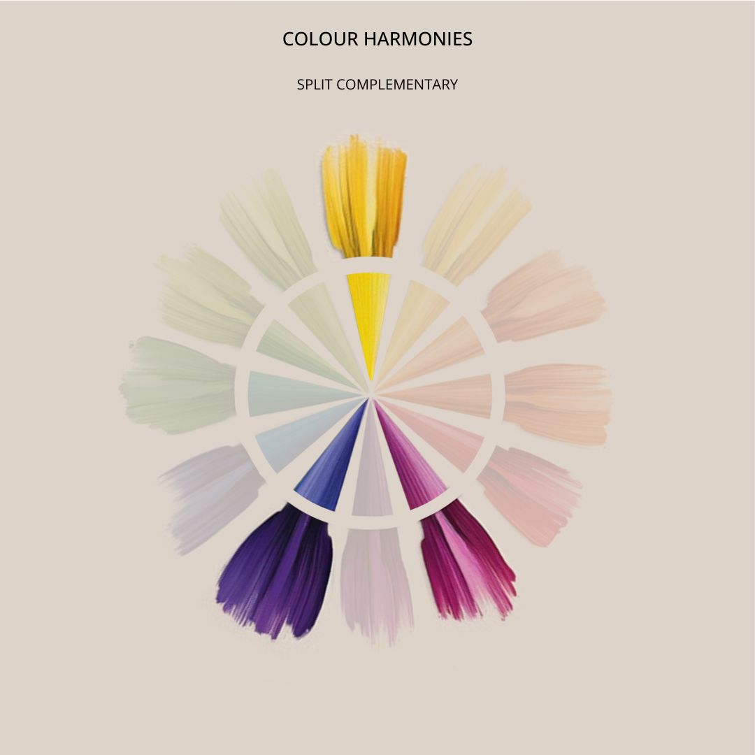
A split complementary colour harmony uses three colours, selected in a triangle shape, within the wheel.
Pick a colour, then use the two colours that sit on either side of the original hue’s complementary colour.
The results are a more varied, but less vibrant, effect when compared to a complementary colour harmony. Making it a safer option for those after something colourful, yet controlled.
Triad
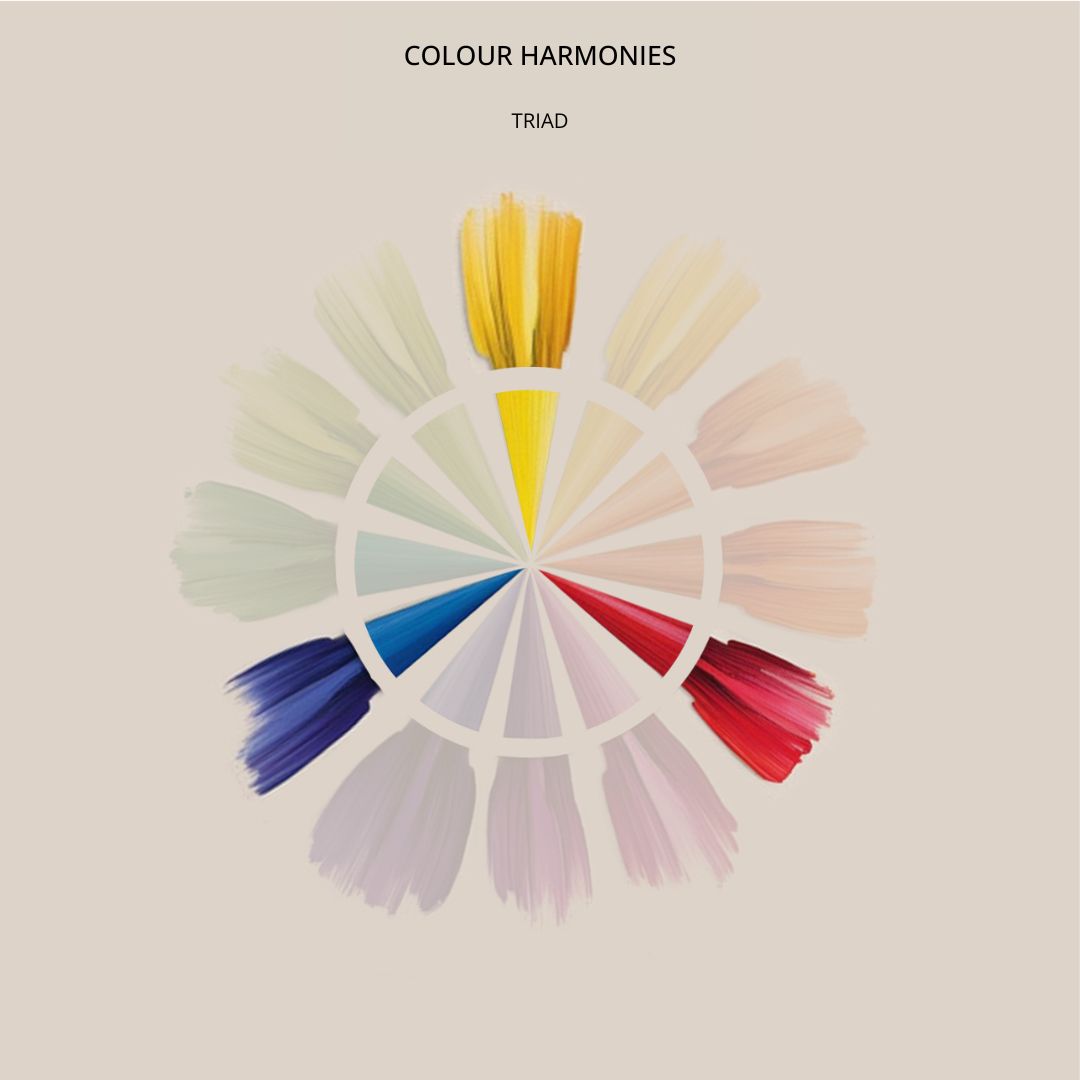
Triad colour harmonies are created by picking three colours that sit equidistantly from each other on the wheel.
Like a complementary scheme, this means you’ll only ever be selecting three primary, secondary or tertiary colours.
With the addition of an extra hue, you can imagine how vibrant a Triad palette can be! An ideal choice for children’s play spaces, but if you want something softer, this one is best avoided.
Tetrad
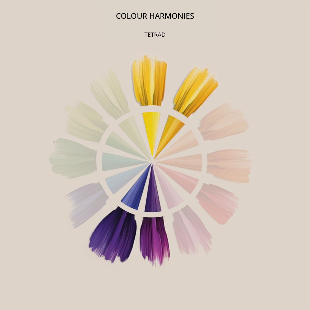
Also called ‘rectangular’ or ‘double complementary’, a Tetradic colour harmony uses four pairs of complementary colours.
The resulting selection pairs either two primary and two secondary colours, or four tertiary colours. That does make this colour harmony a complex one to concept, so it’s worth seeking support from an expert here!
Square
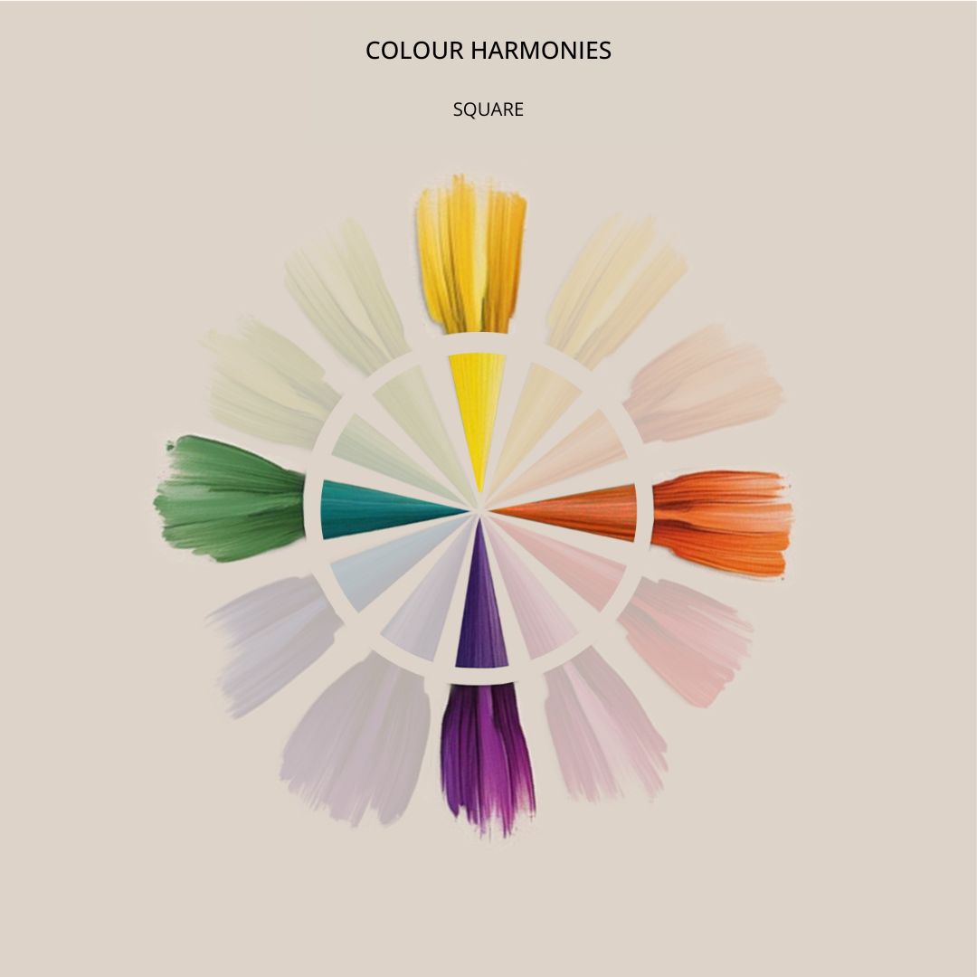
Similar to a Tetrad scheme, a Square colour harmony builds a base from four colours, comprising two complementary pairs.
The difference is, being a square, the selection will always include one primary, one secondary and two tertiary colours.
Warm and cool colours in interior design
The colour wheel is often divided into warm and cool colours, each evoking distinct moods and atmospheres. This is determined by ‘colour temperature’, and plays a crucial role in interior design. Colour temperature influences how a space feels and functions. A well-balanced palette typically incorporates both warm and cool hues to create harmony within a room.
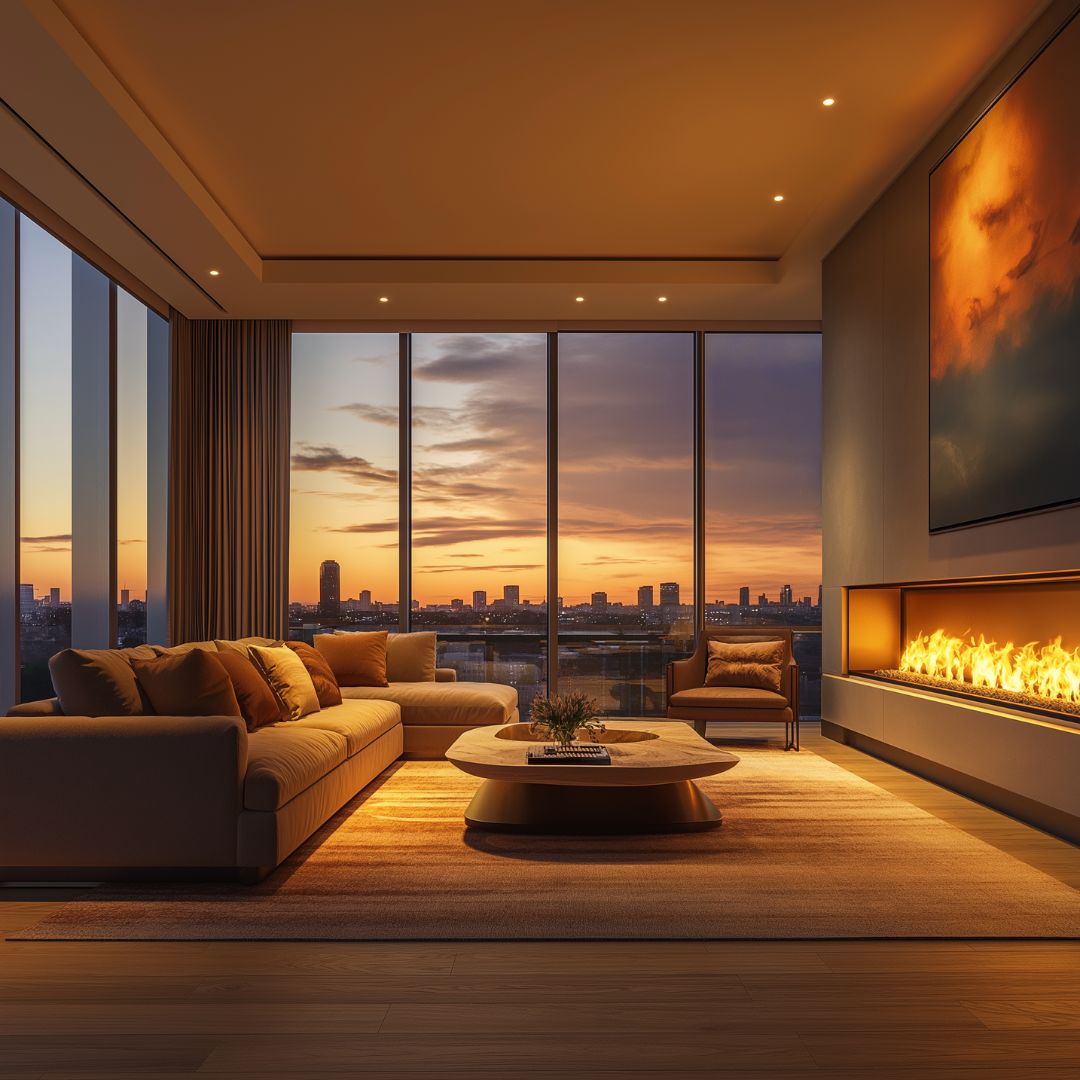
Warm colours, ranging from deep reds to vibrant yellows, are associated with energy, comfort, and warmth—much like the glow of a sunset or the flicker of a fire. They can make a space feel inviting and dynamic, making them ideal for social areas such as living rooms and dining spaces.
Cool colours, including shades of blue, green, and violet, bring a sense of calm and tranquillity. Inspired by natural elements like water and sky, these hues are often used to create soothing, restful environments. Making them a perfect choice for bedrooms, bathrooms, and serene retreats.
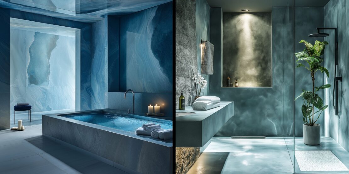
How colour combinations impact a room
The way colours interact with each other can dramatically affect the overall look and feel of a room:
- Contrast and intensity – Pairing dark shades with bright colours enhances the vibrancy of the lighter hue, making it appear even more luminous.
- Warm vs. cool pairings – Placing warm tones next to cool ones makes the warm shade feel even warmer and the cool shade appears cooler, creating a dynamic contrast.
- Space and perception – Warm colours tend to make a space feel cosier and more intimate. Which is ideal for snug living areas or family rooms. In contrast, cool shades create a sense of openness and calm, making a room feel more spacious and airy.
- Neutrals with warm or cool undertones – Even neutrals can lean towards warm or cool tones. For instance, warm greys, creams, and whites can add softness and depth. While cool greys and crisp whites introduce a fresh, modern edge.
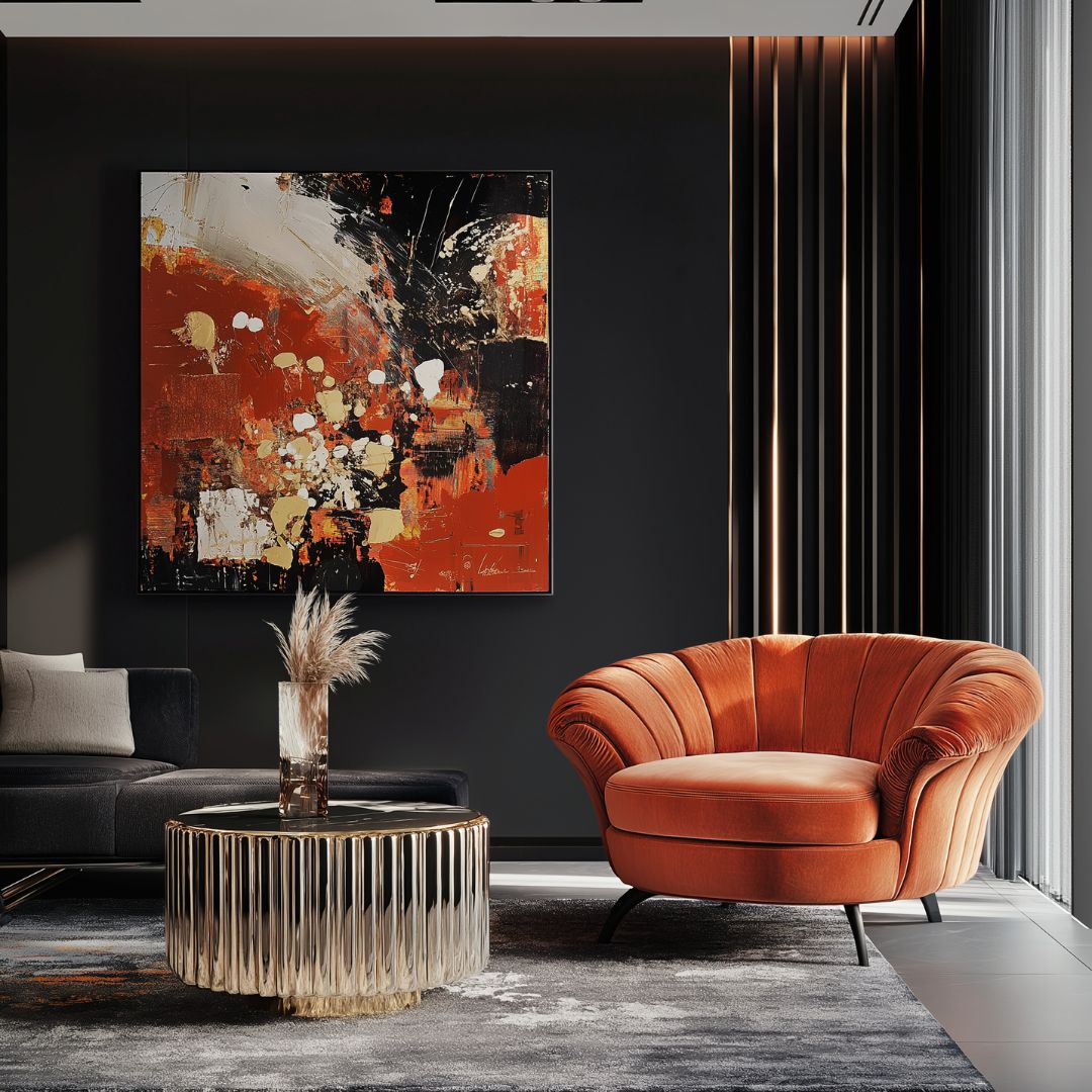
By understanding the balance of warm and cool hues, you can tailor your interior palette to enhance the ambience of a space. Whether you want to create an inviting retreat or an energising environment the right colour scheme is key.
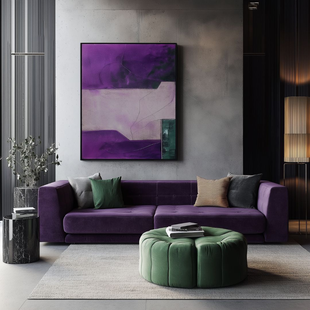
Colour psychology in interior design
Colour has long been associated with mood, emotion, and even behaviour. From the rich hues of stained glass windows in medieval cathedrals to the striking shades of heraldic crests, colour has been used throughout history to evoke specific feelings and communicate meaning. Today, interior designers use colour psychology to create spaces that not only look beautiful but also enhance wellbeing, productivity, and relaxation.
The psychological effects of colour
Each colour has distinct psychological associations that can influence how a space feels and how people react to it. Here’s how different shades impact mood and where they work best in interior design:
Red – Energetic and passionate. Red is known to stimulate conversation and even increase appetite. Making it an excellent choice for dining rooms and social spaces. However, in large amounts, it can be overwhelming, so use it sparingly or as an accent.
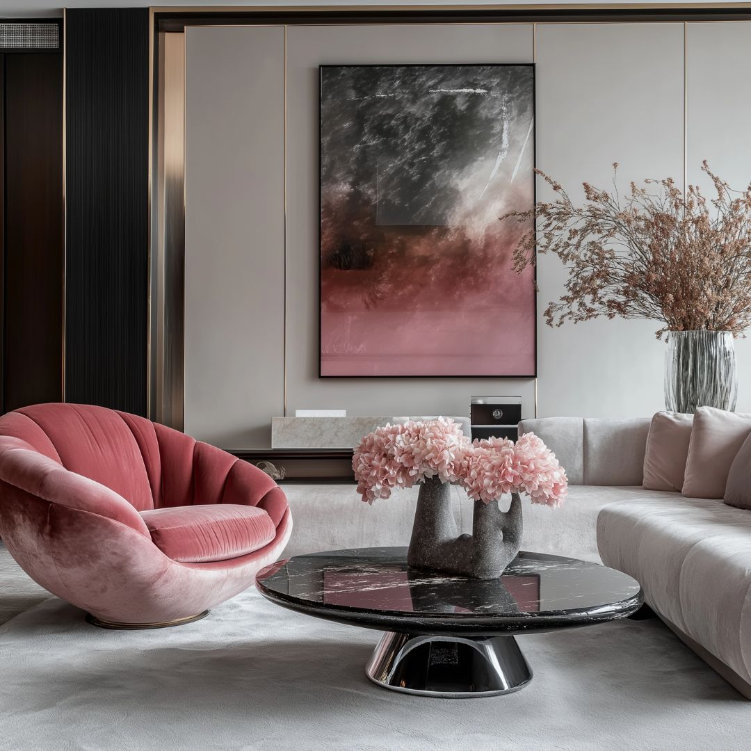
Pink – Soft and nurturing, pink creates a peaceful and soothing environment. Muted pinks are ideal for bedrooms, while bold fuchsia can add vibrancy and energy. To prevent a space from feeling too sweet, pair pink with darker hues like charcoal or black.
Orange – Warm and reassuring, orange is thought to promote stability and aid digestion. It works well in living and dining areas, but as it is an advancing colour, it can make a room feel smaller.
Yellow – Cheerful and stimulating, yellow is linked to optimism and energy. It is a great choice for kitchens and dining spaces. It’s best avoided in bedrooms, as it is thought to heighten emotional intensity.
Green – Associated with nature, balance, and tranquillity, green is one of the most calming colours, making it perfect for bedrooms and living spaces. However, too much green may create a sense of complacency—adding red or orange can introduce energy.
Blue – Cool and calming, blue promotes relaxation and intellectual thought. It is ideal for bedrooms, bathrooms, and studies, but certain shades can feel cold, so choosing blues with warm undertones can help maintain a welcoming atmosphere.
Purple – Symbolising creativity and luxury, purple is often associated with spirituality and imagination. It works beautifully in bedrooms for a restful retreat but can feel overpowering in deep shades, so balance it with softer tones.
Brown – Grounding and stable, brown adds warmth and security, making it well-suited for living rooms. However, using brown alone can feel heavy, so incorporating fresh accents like green or blue helps add vibrancy.
Black – Sophisticated and dramatic, black is best used in moderation to create contrast and depth. It pairs well with light colours and metallic finishes for a striking, elegant look.
White & Neutrals – White and neutral tones offer a sense of cleanliness, calm, and versatility. Warm neutrals like beige and cream bring softness, while cool greys and crisp whites create a modern, airy aesthetic.
While colour psychology isn’t an exact science, using it thoughtfully in your interiors can help shape the way a space feels and functions, allowing you to design a home that not only looks luxurious but also enhances mood and lifestyle.
How colour influences the perception of space
Colour has the power to transform the way a room feels without changing its actual dimensions. By carefully selecting the right shades, you can make a space appear larger, cosier, taller, or more intimate—all with a simple coat of paint. Whether you want to create a bright, airy atmosphere or a warm, enclosed retreat, understanding how colour affects spatial perception can help you design interiors that feel just right.
Expanding a space
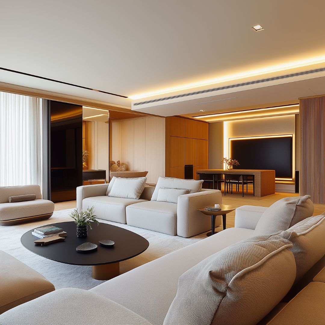
Lighter colours, such as soft neutrals, pale blues, and whites, reflect light and make surfaces recede. Creating the illusion of a larger and more open space. These shades are perfect for small rooms, making them feel airier and more spacious.
Making a room feel cosier
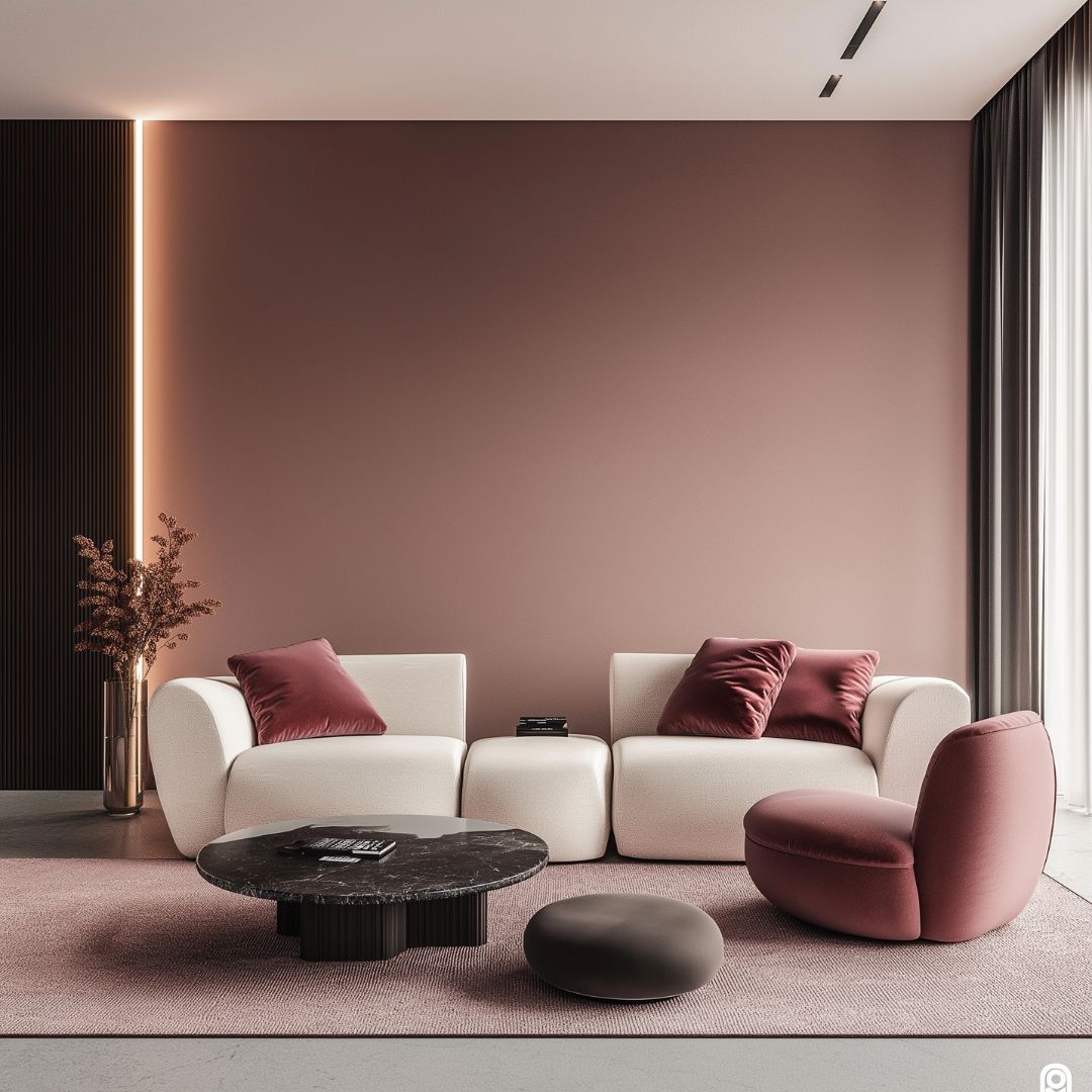
Darker hues, such as deep blues, rich greens, or warm terracotta, absorb light and bring walls inward, making a space feel smaller and more intimate. These tones work beautifully in lounges, libraries, or bedrooms where a sense of warmth and enclosure is desired.
Altering ceiling height
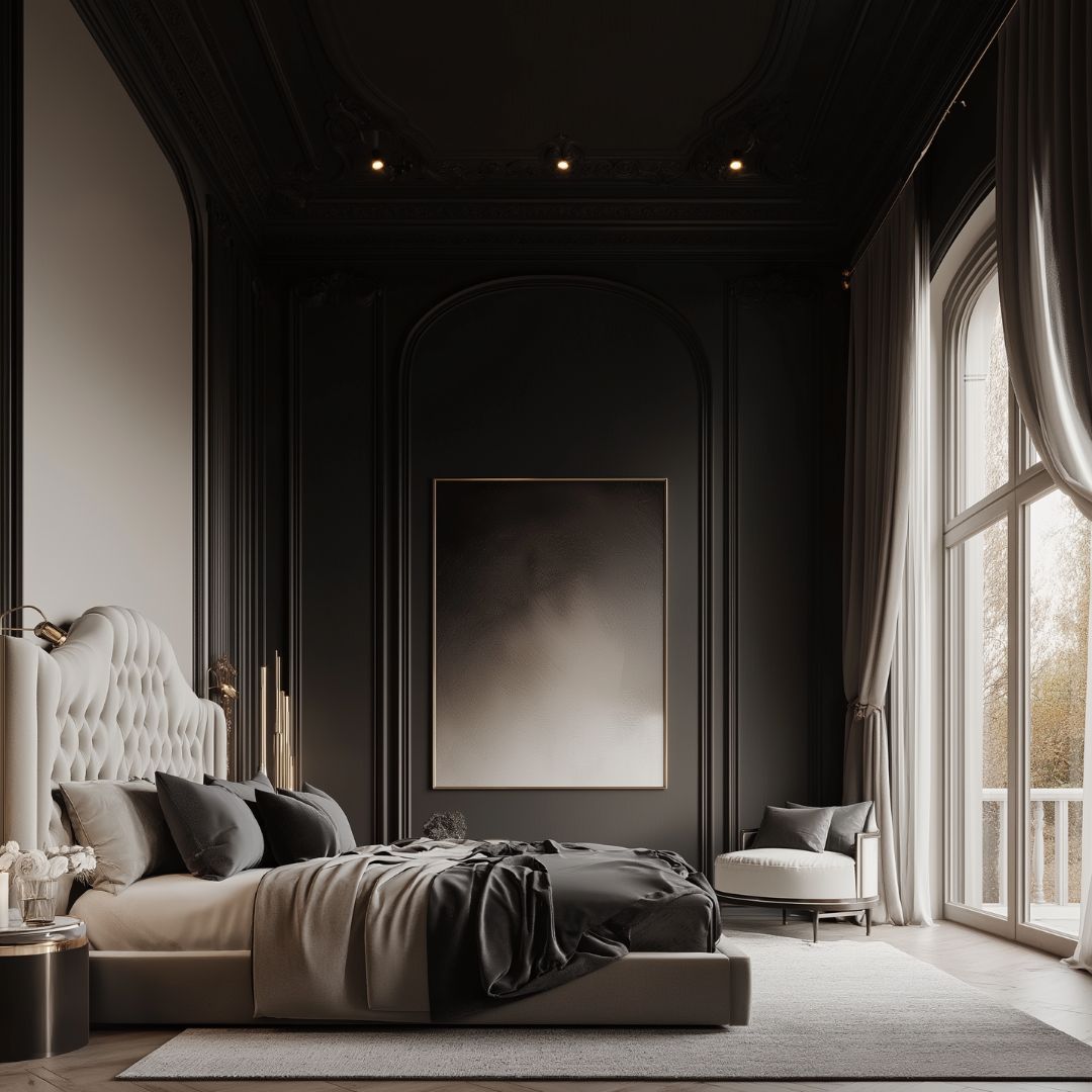
- To make low ceilings appear higher, keep the ceiling a lighter shade than the walls. Such as crisp white or soft pastel, to create an airy, open feel.
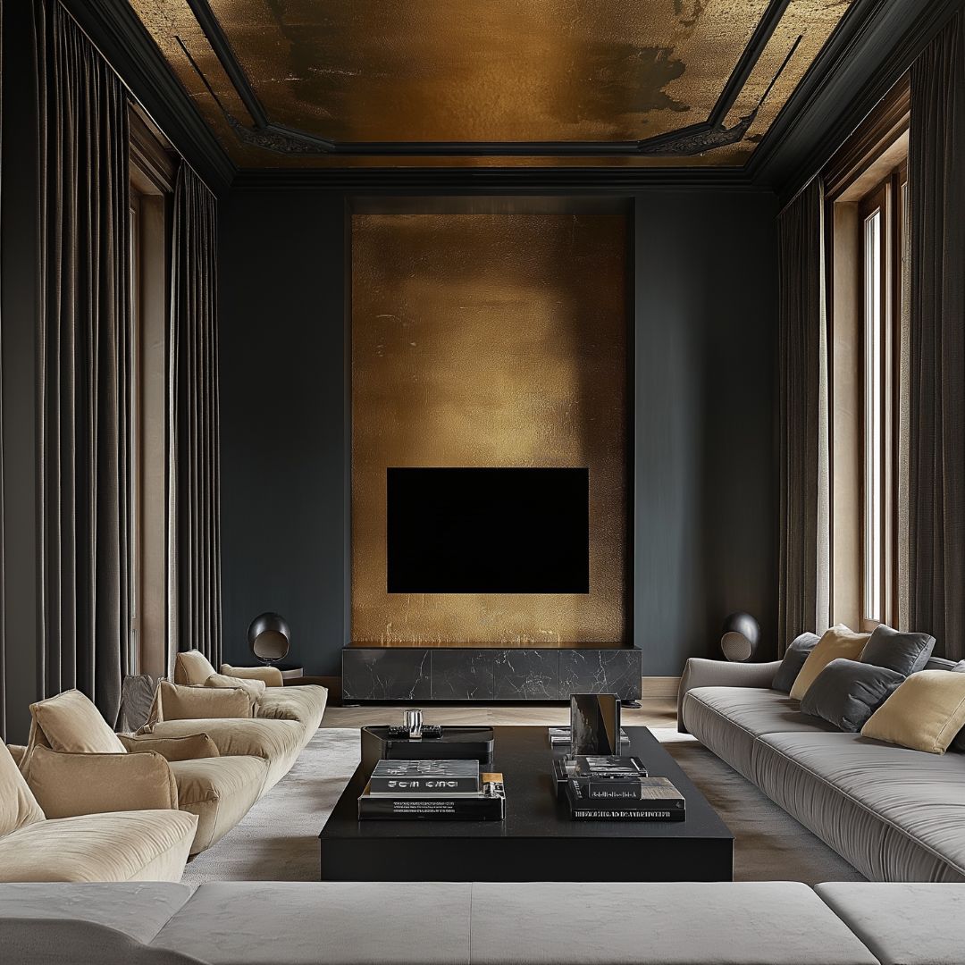
- To create a cosier, more enclosed space, paint the ceiling in a darker tone than the walls. Bringing it visually lower, making the room feel more intimate.
Widening a narrow room
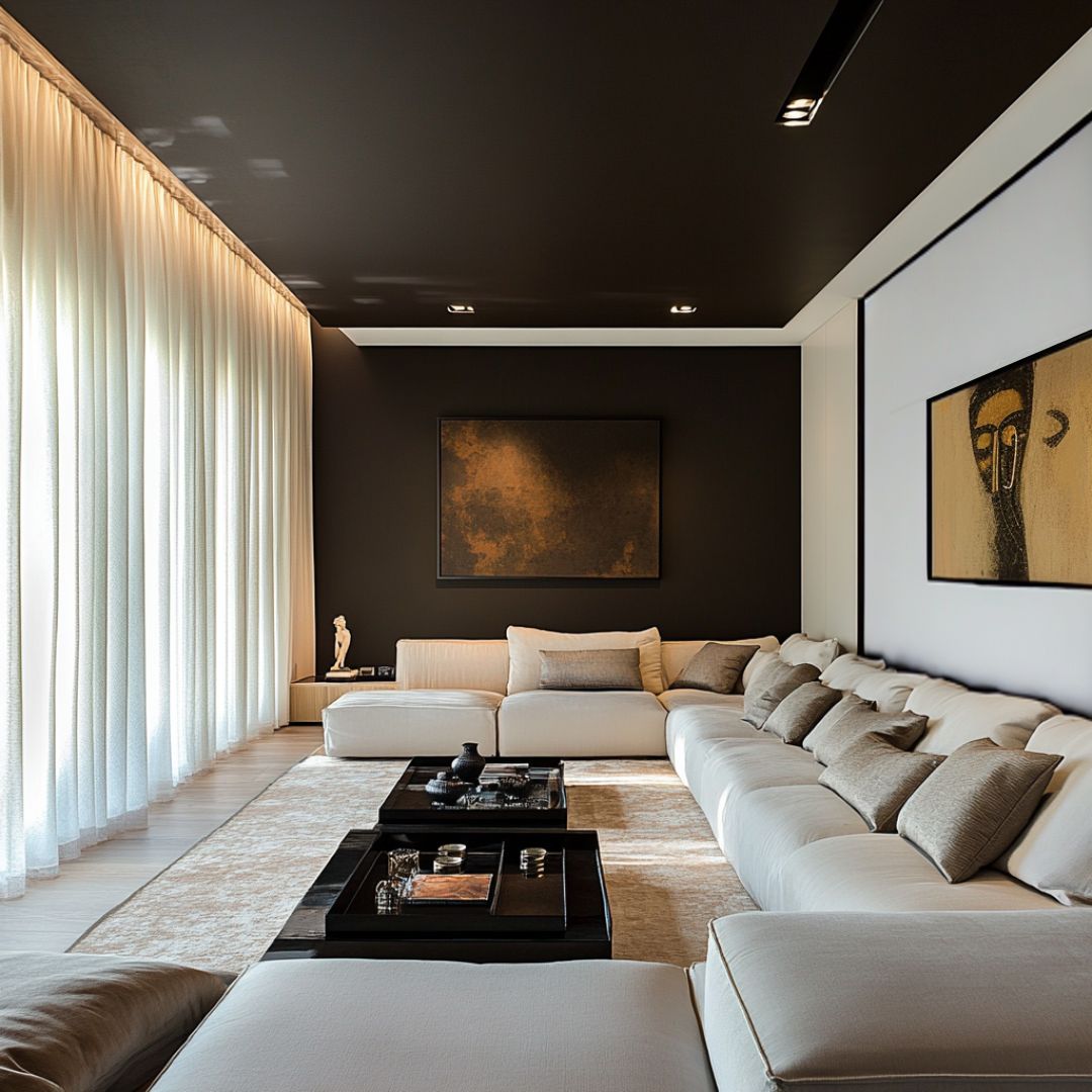
If a space feels too long or corridor-like, painting the back wall and ceiling in a darker colour while keeping the side walls lighter can make it feel wider and more balanced. This technique works particularly well in hallways and narrow rooms.
Narrowing an oversized space
For rooms that feel too open or unbalanced, painting both side walls in a darker shade while keeping the ceiling and back wall lighter can help bring the walls inward, creating a more proportionate and inviting space.
Shortening a long room
If a room feels too stretched out, painting the far wall in a darker shade helps visually bring it forward, making the space feel more intimate and well-proportioned.
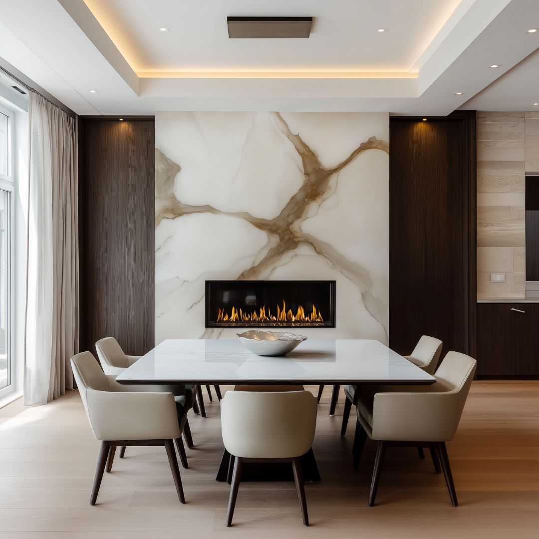
Highlighting a feature wall
To make a particular wall a focal point, use a contrasting colour while the surrounding walls are a lighter or darker colour, drawing the eye towards it. This is a great way to accentuate fireplaces, artwork, or architectural details.
Lowering wall heights
If you want to create a cosier, more grounded effect, painting half of the walls in a darker shade will shorten the perceived height, making the space feel more intimate and anchored.
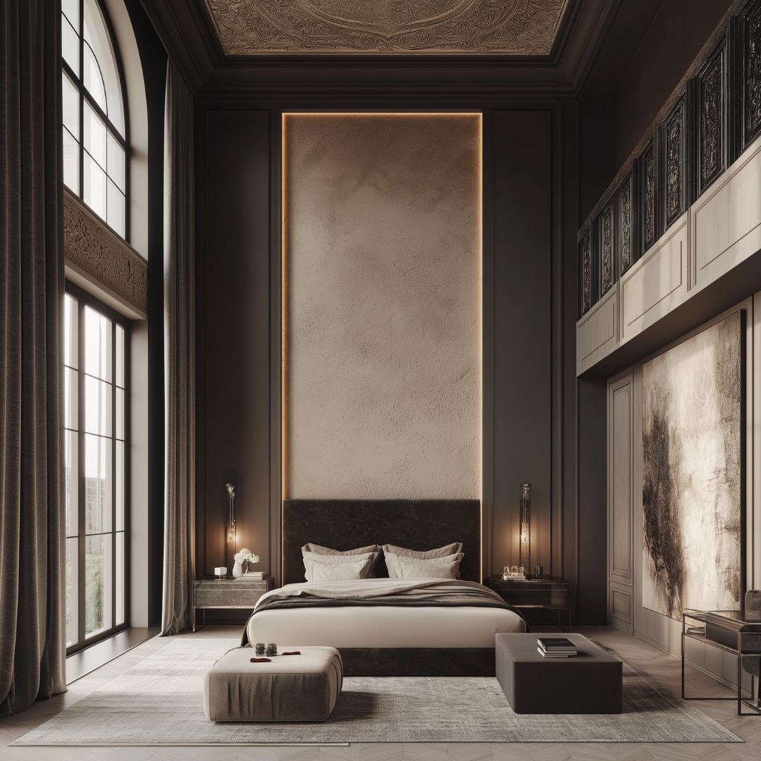
By using colour strategically, you can manipulate depth, height, and proportion to enhance the flow and atmosphere of any space. Whether you want to open up a room, create a snug retreat, or improve balance, colour is one of the most powerful tools in interior design.
Benefits of working with an interior designer for colour palette selection
Choosing the right colours for your home can be overwhelming, but working with an interior designer can help. Their expertise ensures your colour palette is not only visually stunning but also perfectly suited to your space, lifestyle, and design goals. Here’s how an expert can help:
1. Expert knowledge of colour theory
Interior designers understand the science of colour psychology, how different shades interact, and how they influence mood, energy, and spatial perception. They can help you create a home that feels balanced, harmonious, and reflective of your personality.
2. Creating a cohesive look
A designer ensures that your colour scheme flows seamlessly from room to room. They maintain a consistent aesthetic throughout your home while allowing for variety and interest. They will also ensure that the colours stay cohesive from day to night and as the light transitions from natural light to artificial. And for all your intended purposes for the room.
3. Enhancing space & light
By applying colour strategically, designers can make small spaces feel larger and brighter, or large spaces feel more intimate and inviting. They consider factors like natural light, ceiling height, and architectural details to select the most flattering shades.
4. Access to exclusive colours & finishes
Interior designers have an extensive network and as a result access to luxury paints, bespoke colour blends, and premium finishes that aren’t always available to the general public, ensuring a unique and sophisticated result.
5. Avoiding costly mistakes
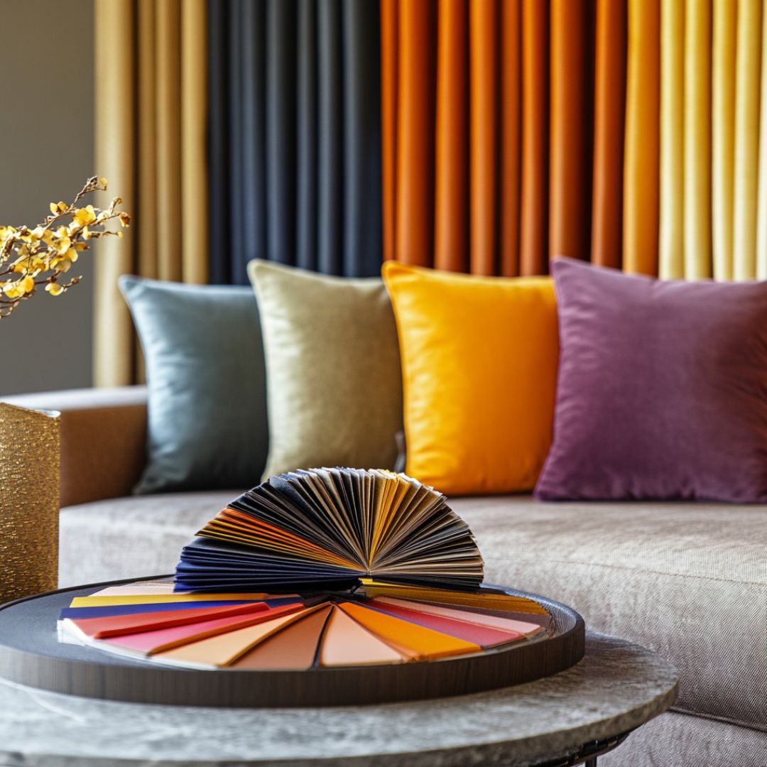
Selecting the wrong paint shade or finish can be an expensive mistake. A designer will guide you through the process, ensuring the colours you choose work beautifully with lighting, furnishings, and textures.
6. Customised to your lifestyle & preferences
Your home should reflect your personality and lifestyle. A designer will consider your daily routine, favourite colours, and emotional responses to different shades, creating a space that feels personal and inviting.
7. Maximising investment value
If you’re designing for resale or long-term appeal, a professional can recommend timeless, elegant colour schemes that enhance property value and attract potential buyers.
8. Seamless coordination with bespoke furniture
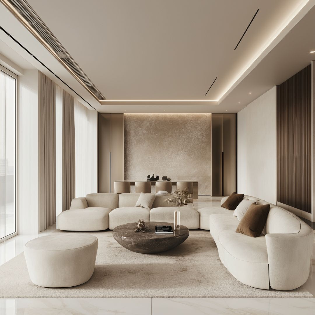
A custom-designed interior isn’t just about the right wall colour—it’s about ensuring every element works in harmony. An interior designer can source or create bespoke furniture that perfectly complements your chosen colour palette, ensuring a cohesive and polished look. From custom-upholstered sofas in the perfect shade to artisan coffee tables made by master craftsmen in complementary tones, tailored pieces bring balance and elegance to your space, making your design feel truly curated and unique.
Transform your space with a thoughtfully curated colour palette
Work with our award-winning interior designer to ensure that your colour choices enhance your home, reflect your personality, and create a space that feels effortlessly luxurious. Whether you’re drawn to bold statements or subtle sophistication, our expert guidance guarantees a flawless and cohesive result.
To discuss your interior design project with us, please contact us by phone +44 (0) 203 131 4515 or email us at sales@juliettesinteriors.co.uk. You can also book an appointment to come and see us at our London design studio.