Choosing home colour schemes can be difficult – it’s a lot of pressure trying to find ones that you love and ones that also work well. We want to make these decisions easier for you by looking at which colours work for each room.
We’ll be using colour theory, the feeling these colours portray, and which colours work according to Feng shui. To help us advise as best we can, we spoke to Alison Standish, Colour Wellbeing Consultant, and the owner and founder of The Colour Ministry.
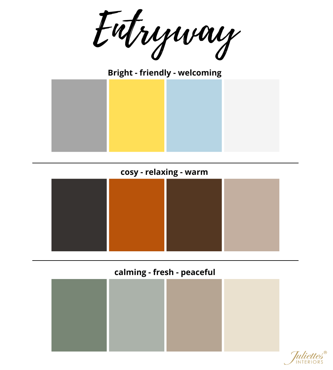
Entryway
The entryway is the first room that guests will see when entering your home, and first impressions count! The main feeling that entryways and hallways should portray is a welcoming feeling.
It’s important to keep the size of your hallway in mind, and how much natural light is available – it’s best to avoid too many dark colours, as this can make the space appear smaller and may not give off a ‘welcoming’ tone. Neutral colours are always a good option as they are bright, welcoming, and fresh.
According to Feng shui, using light greys and whites in the home bring joy, clarity, precision, and brightness. For a pinch of colour, yellow is an extremely friendly and inviting colour, as are other warms tones such as orange and red. If you want your home to feel like a relaxing place for all, try calm colours such as blue and green.
Entryway | Home Colour Schemes
If you want a brighter, more colourful feel to your hallway, home colour schemes that combine white with light grey, pale yellow and dusty blue are great options.
Alison commented: “Yellow is a bright and friendly colour, which invites in fun and childlike behaviour. Blue is gentle and soft and gives an antiseptic cool feeling in the entryway. This is a great combination for a small entryway.”
For a warmer and cosier feel, try using a warm-toned off-white, rusty orange, wood tones and darker grey or black accents. To create a calm feeling in the entryway, use shades of sage green with cool-toned neutrals.
“The cosy and warm selection gives us a feeling of entering the womb, the colour orange invites us into a warm environment – orange is a powerful colour which activates the sacral area of the body.” Alison added.
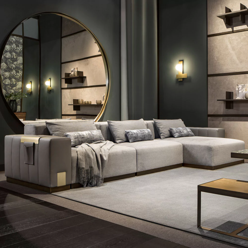
Living Room
The living room tends to be the main gathering point for families – it’s where everybody relaxes and spends time together, so the colour scheme should support this.
If you’d like a more energetic feel to your living room, try brighter colours such as reds and oranges. For a calmer and more relaxing space, shades of green or blue are perfect – they also signify growth and new beginnings in Feng shui.
Alison explains: “Green decreases blood pressure by oxygenating the body, so it is a great colour for this space.” According to Real Homes, green was the most popular living room colour in 2022.
Purple can give a sophisticated look, and lighter shades of purple are also calming. According to Feng shui, earthy browns, yellows and neutrals are also great options as these colours signify grounding, support, and self-care.
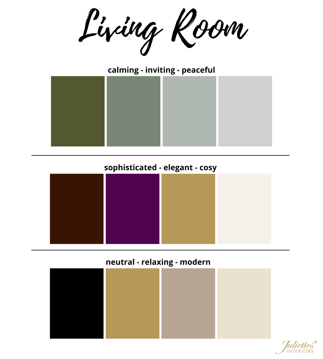
Living Room | Home Colour Schemes
With home colour schemes for the living room, why not mix a few different shades of green for the ultimate calming effect, or combine an olive green shade with rusty orange for a statement look?
If green isn’t the colour for you, try using shades of purple – opt for darker berry tones with gold accents for a cosy yet sophisticated vibe.
“Purple works great in a big room and could make a nice feature wall. Purple is a very powerful colour and is associated with the crown area of the body. This colour brings inspiration and is wonderful if you are looking to meditate as it raises the vibration of your energy.”
If colour isn’t your thing at all, go the neutral route and combine shades of taupe with off-white and gold or black accents.
Kitchen
For some, the kitchen is the main gathering area of the home rather than the living room. It’s another place where the family tend to socialise, whether it’s over a morning coffee and breakfast before school and work, or on an evening whilst dinner is being prepared – there is often a lot of activity in the kitchen.
There are many different directions you can go with your kitchen home colour scheme. It could be an energy-filled space which encourages conversation and socialisation, or it could be a more relaxed area to take away any extra stress whilst preparing meals.
If you want an energetic, social kitchen, you should use a brighter colour palette.
Alison adds: “Using bright yellow in the kitchen automatically activates the digestive processes – yellow also brings clarity and activates mental actions – great for creating the perfect menu! When balanced with grey, the yellow colour really pops.”
If you think your kitchen is a stressful environment, opt for calming colours such as blues and greens, or earthy tones such as browns. A popular choice for many is to keep the kitchen simple and fresh by using mostly whites and greys. According to Feng shui, white represents purity and cleanliness. It also creates a clean backdrop, highlighting the rainbow of foods we see in the kitchen.
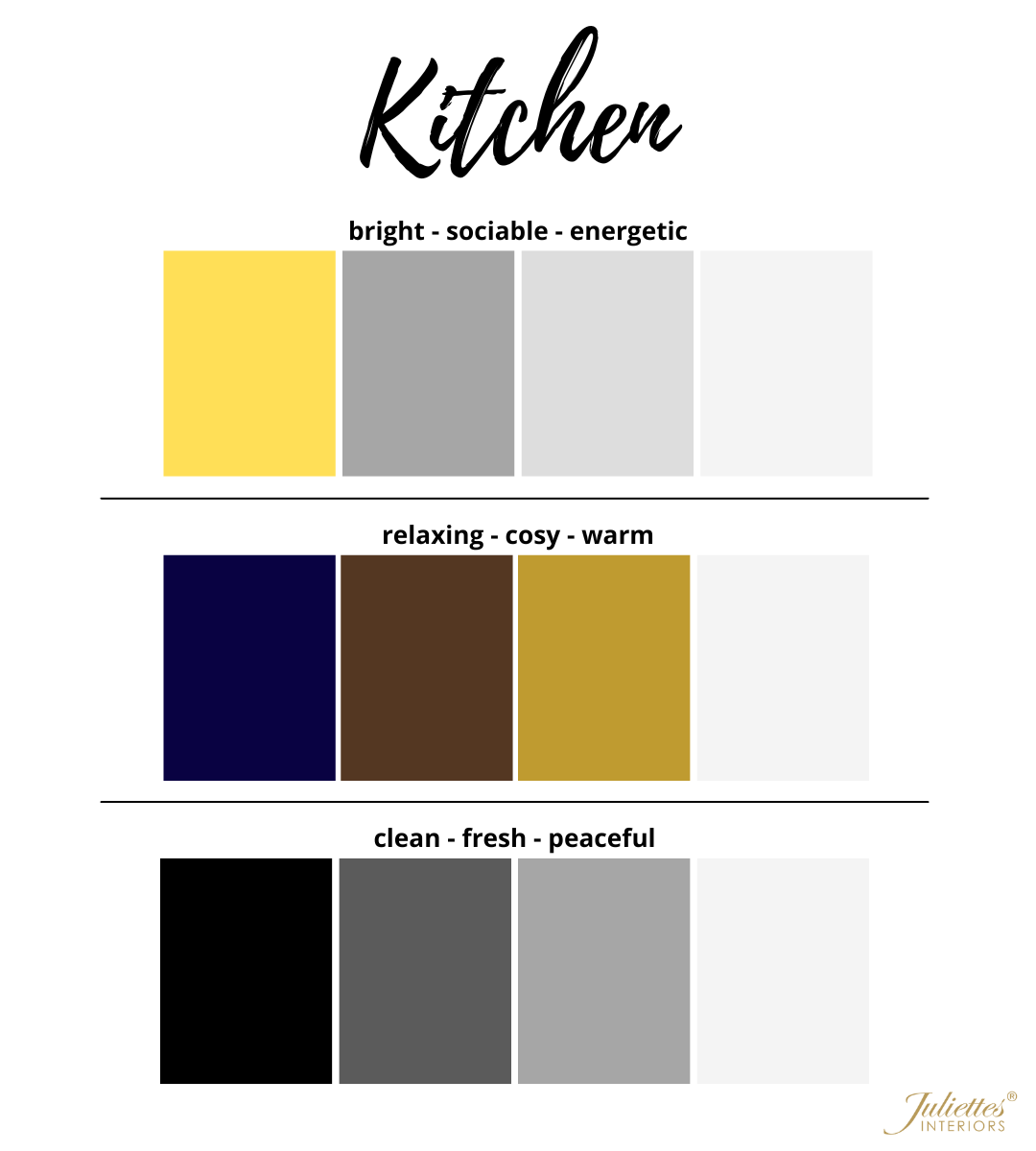
Kitchen | Home Colour Schemes
For the kitchen, try combining shades of yellow or orange with white, grey and silver for an energetic feel. If you’d like a more relaxed feel, opt for a shade of blue and combine it with white, gold, and wooden tones.
For a blank backdrop, stick to white with shades of grey and accents of silver and black. Alison recommends adding some brighter accessories to a plain kitchen to bring in some energy.
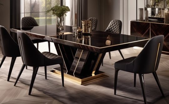
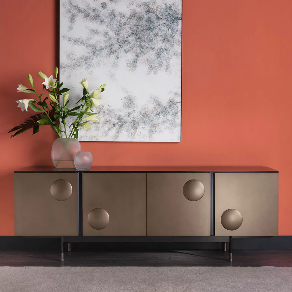
Dining Room
Although the living room and kitchen are often referred to as the heart of the home, the dining room is equally important as this is where the family often gather to eat meals, catch up, and spend quality time together – especially during special events such as birthdays and Christmas.
This room should be energetic and exciting to encourage conversation and socialisation, therefore brighter colours such as reds, oranges and yellows could work well. As mentioned above, yellow can encourage hunger, so this could be a good choice for this room.
Brown-toned neutral shades are also a great option for the dining room as it helps guests feel settled and relaxed – brown is connected to the earth element according to Feng shui, which is stable and steady. Alison suggests that this colour scheme would work particularly well in a large country kitchen which is surrounded by nature.
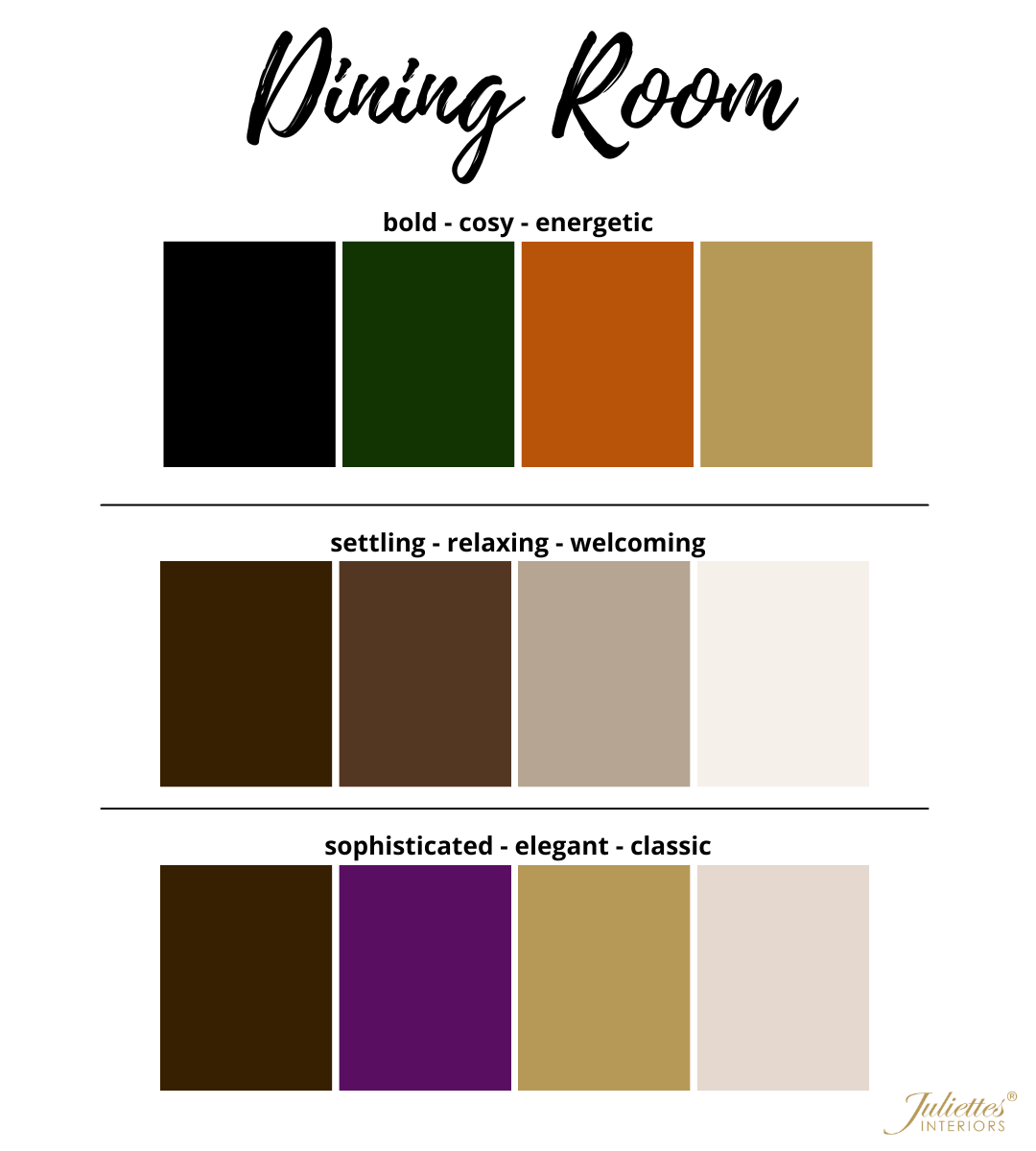
Dining Room | Home Colour Schemes
For an energetic feel, opt for a shade of orange combined with navy or forest green. “Orange is great in a dining room, it really is a colour that can be used for any social space as it’s the colour of humour. When balanced with deep green, it will create a space for deep conversations with laughter and energy. “ Alison commented.
For a more neutral but still inviting feel, try using earthy tones – you can pair dark wooden furniture with beige, creams, and taupes to achieve this.
You can create an elegant and sophisticated dining room that impresses guests by pairing shades of purple, such as mauve or grape, with gold accents – this may not necessarily trigger any socialisation, but it will certainly give your dining room a luxurious feel.
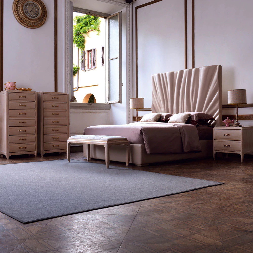
Master Bedroom
The bedroom is our safe space where we go to fully relax and unwind. We don’t tend to spend that much time in our bedrooms unless we’re going to chill out, so the home colour scheme should reflect this.
Shades of blue and green are great options – they are relaxing colours, as they are often the colours we see in nature. Lighter shades of blue and green are especially calming. Deep, dark shades of blue are relaxing and meditative.
Alison also revealed that navy blue and indigo shades allow the mind to release negative patterns – these dark, powerful colours would work best in a large bedroom.
Pink and peach could work well for the bedroom too, they are comforting and calming shades and can even help attract a partner! According to Feng shui, these shades can help create softness in an existing relationship or can help invite a new partner into your life – this is very fitting given that the bedroom is where the magic happens.
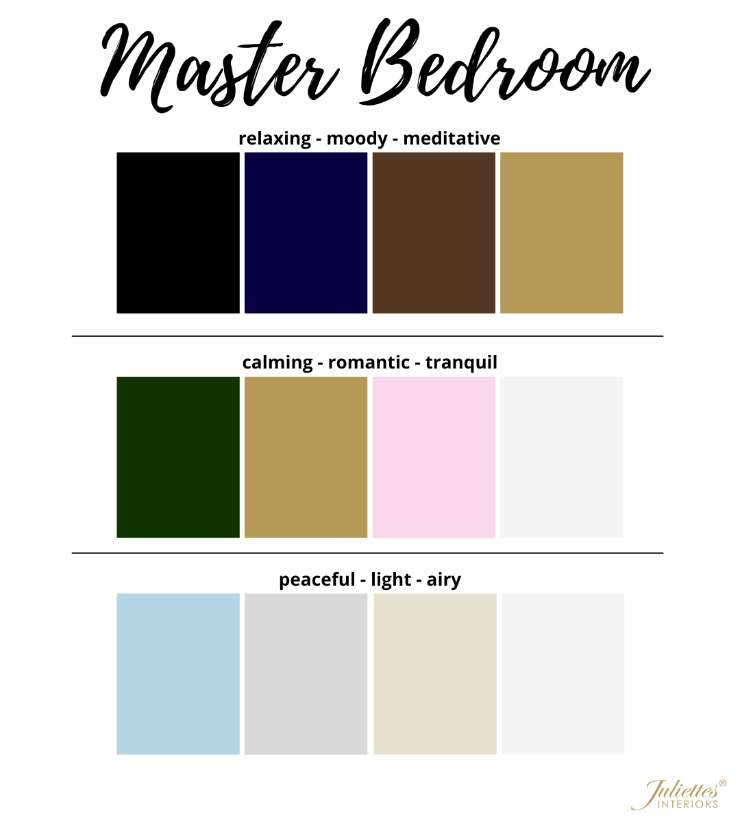
Master Bedroom | Home Colour Schemes
A great colour combination for the bedroom is forest green and pastel pink, as it brings a relaxing, nurturing feel.
Alison comments: “Both green and pink rule the heart area of the body and in a bedroom, this energy will be both loving and protective during sleep. They will also bring a deep connection for the couple that might share the room.”
For ultimate relaxation, why not use a deep shade of blue with black accents? Or, if you’d prefer your bedroom to have a lighter and more airy feel, opt for a dusty blue with white, cream and silver – this will still bring a relaxed feel without the dark colours.
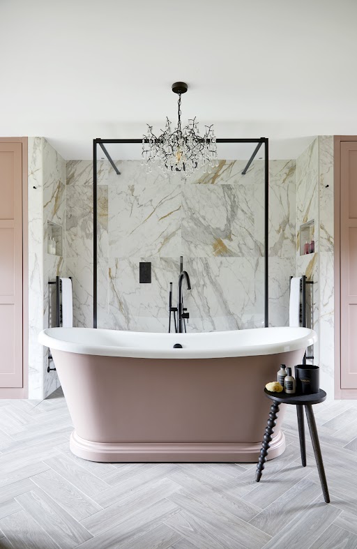
Bathroom
Choosing a colour scheme for your bathroom depends on the feel you want. Some will wish for their bathroom to feel like a spa in their own home, bringing a fresh, revitalising and clean feel with shades of white.
Some may want to take their relaxation a step further and use more calming shades of dark grey, green, blue, or purple, so they feel loosened up during their evening bubble bath!
Others won’t want their bathroom to feel like a relaxed, Zen space – instead, they might want this to be an energetic area, encouraging an exciting start to each new day and helping them to wake up during their morning shower.
To achieve this, use pops of colour in the bathroom – you could create a colourful space by combining shades of yellow with pink or adding pops of red into a mostly white bathroom. Pastel colours are also a great option for bathrooms according to Feng shui.
Alison explains: “Using yellows and pinks bring energy to the eyes first thing in the morning. Yellow, like a lemon, gives us more saliva to the mouth without us evening knowing, and digestion is already starting to happen. Pink is the heart colour – it activates our open energy and makes us smile.”
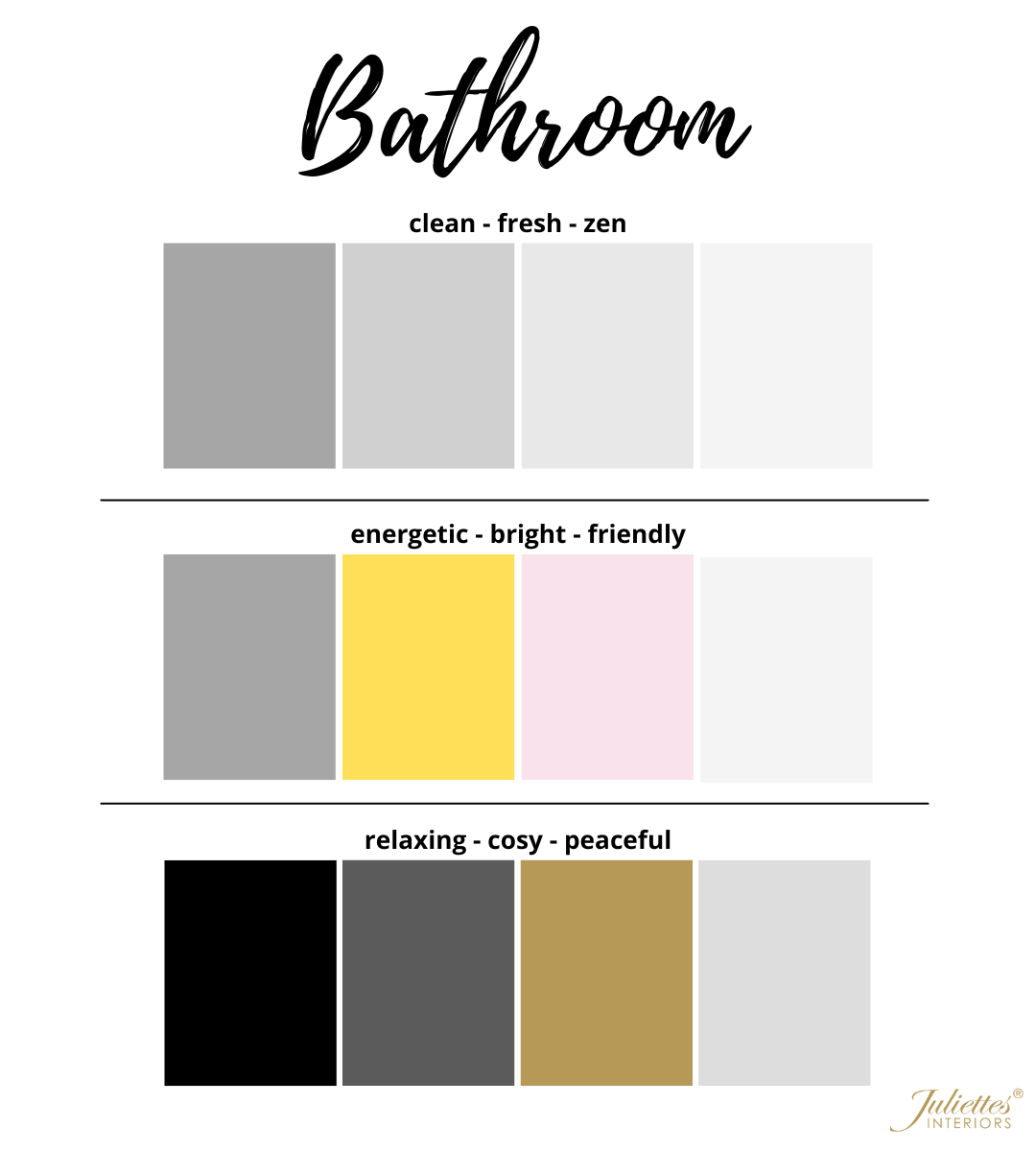
Bathroom | Home Colour Schemes
For a spa-like atmosphere, try using a lot of shades of white with some other light neutral tones such as beige or grey – this will bring a completely fresh, clean feel to the space.
For a more relaxed feel, try using darker colours such as dark grey, green or blue, combined with white and black or gold accents. Adding quality accessories into a bathroom with this colour scheme will add to the already luxurious look.
If you’d like your bathroom to be full of energy for those early mornings, you could have a pastel-themed bathroom with pale pinks and yellows, or keep it mostly white with pops of bright colours.
Office
Your office design is completely dependent on what environment you prefer to work in. Some people are motivated by bright colours and patterns, as it helps them be more creative and energised. Others may prefer a simple, toned-down space to help them stay focused on their work.
If you work best in a relaxed environment, try using calming colours such as blues and greens – if you want a blank space free from distractions, neutral colours such as whites and beige can provide the perfect workspace.
If your career involves being creative, try using shades of yellow, orange, or pink – these colours can help boost creativity. Red and blue are also great colours to use in your home office as they enhance brain performance, blue is also a calming colour and will help to reduce stress, as will shades of green and earthy tones.
If you’re easily distracted and would prefer a blank backdrop for your office, white is a good option according to Feng shui as it symbolises high energy levels and is associated with possibilities, focus and purity.
However, having too much white in your home office can be unsettling and uninspiring – it could be a good idea to combine white with grey, as this is a soothing colour. Alison advises using a lighter grey shade, as a dark grey can become overpowering. Adding brighter accessories can also break this up.
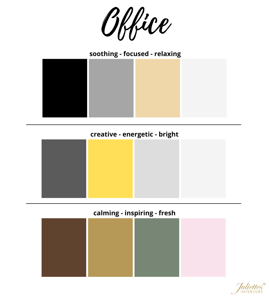
Office | Home Colour Schemes
For a quieter space that won’t offer any distractions, combine grey and white with accents of black and wood tones for a soothing space.
To encourage creativity, try using pops of yellow within a white and grey room. Another option would be to combine pastel pink with sage green, as this will provide a calming but inspiring effect.
Alison explained: “The green is calming and connects to your heart energy, along with the pink which is more uplifting – adding in brown tones is grounding. These colours inspire nature, giving you time to breathe.”
Ultimately, the home colour schemes you choose for the rooms in your house are completely personal and can be a difficult decision. To ensure you make the right choice, Juliette Thomas, founder and managing director of Juliettes interiors, advised:
“Always use the small test pots before making a final decision on your choice of colour – add a test sample to an area against a backdrop of the furnishings to get a real feel for how the colour may change when next to other items, and to see how the light coming through a window will change the colour. You’re looking for that instant “yes” – if you get that, then go for it. If in any doubt try another sample until you feel very happy with your choice.”
Opting for certain shades that provide a specific feeling can help you achieve the mood you want for each room and can make people feel a certain way, such as relaxed, welcomed, or sociable. For more expert advice on colour schemes and the interior design of your home, feel free to contact us. Or, if you want to learn more about interior design, why don’t you consider Learning Interior Design with Juliettes Interiors?