On 2nd December, the Pantone Colour of the Year for 2023 was crowned. This shade was named Viva Magenta, a “nuanced crimson red tone that presents a balance between warm and cool.”
Read on to find out more about Viva Magenta, alongside some expert tips on how to incorporate Pantone magenta into your interior.
What Does Viva Magenta Signify?
According to Pantone, the inspiration of the rich, purple-tinged red tone of Viva Magenta is rooted in nature. Citing the pandemic alongside multiple other climate-shifting events that the past few years have thrown at us, Pantone has placed a significant emphasis on embracing the natural and digital worlds in tandem with this shade reveal.
Pantone magenta is described as “brave and fearless, a pulsating colour” that symbolises “a primordial signal of strength”. Pantone’s message is clear here: the spotlight on this colour prompts us to look inwards and embrace our nature, with the tone baring a striking resemblance to the rich pink and red hues that all humans possess beneath our skin.
Pantone also explains that “Viva Magenta’s organic origins hail from the cochineal beetle.” The cochineal beetle is an insect that produces the natural dye carmine – a dye that is widely used in red-toned products across the sectors of fashion, beauty, and interiors.
The Magentaverse
The purple undertones of the Pantone magenta shade make it a natural progression from the Pantone Colour of the Year 2022, Very Peri, as well as WGSN and Coloro’s 2023 Colour of the Year, Digital Lavender. If you haven’t already, you can check out our Digital Lavender Colour of the Year 2023 blog and learn how you can incorporate it into your home.
These purple tones signify aesthetics of the ever-expanding digital age, bringing to mind images of cyberspace, NFTs, and the Metaverse. With the intermingled warm and cool tones of Viva Magenta, this shade is a harmony of natural and digital inspiration, collating the past, present, and future in one zeitgeist-defining shade.
In the words of Pantone, “Viva Magenta merges the richness, warmth, and strength of natural matters with the rich, open horizons of the digital world.”
The Colour Psychology of Viva Magenta
We previously spoke about colour theory and how it can affect our mood in our Digital Lavender blog, but here’s the rundown if you missed that.
Cool or muted tones have shorter wavelengths, while warmer, more vibrant tones have longer wavelengths. Research shows that short wavelength colours, such as lavender, have a calming effect on the mind, whereas long wavelength colours, such as red, tend to have a more energising and invigorating effect.
Pantone Magenta is described as a ‘hybrid colour’, meaning that it straddles the line between warm and cool. Of course, being in the red family, the shade is a predominantly warm tone. This makes for a powerful shade that packs a lot of punch, inspiring action and energy in its onlookers.
Its subtle cool undertones, however, make Viva Magenta a versatile shade that can be tastefully implemented in any interior. Check out our Viva Magenta Pinterest board below for some inspiration.
Decorating With the Pantone Colour of the Year 2023
On the topic of Viva Magenta in interiors, Pantone has a few tips to offer. “Daring designers can harness the full power of the Pantone Colour of the Year as a velvet couch or lacquered wall,” reads the Viva Magenta announcement article.
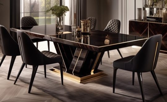
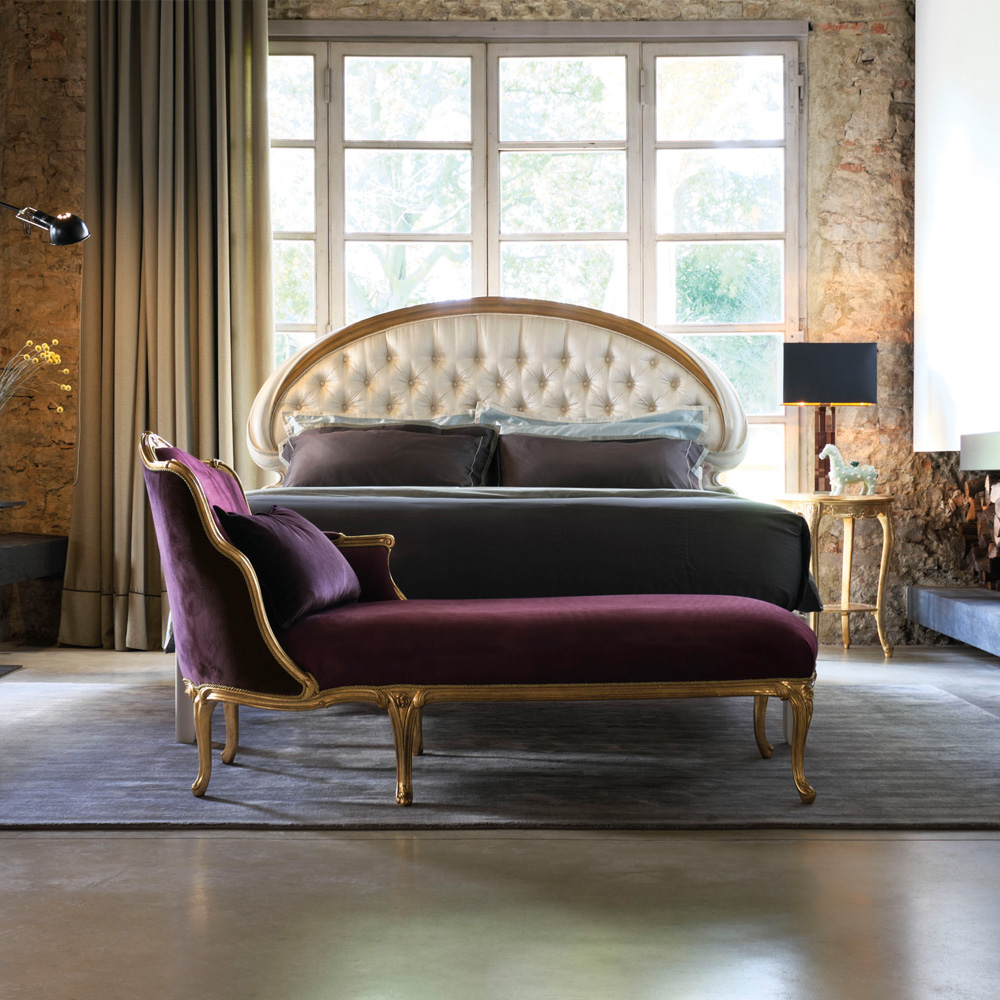
We at Juliettes Interiors are especially keen on pairing Viva Magenta with velvet textures. For example, magenta velvet sofas, armchairs, or bedding will create a superbly dramatic focus in any room.
“The combination of Viva Magenta’s rich red tones with velvet textures will make for a divinely decadent visual,” says Juliette Thomas, founder and Director of Juliettes Interiors. “This will inject a bit of eclecticism into any room, instantly elevating the space.”
Here are our top picks for furniture featuring magenta upholstery:
-
 High Backed Venetian Style Winged Armchair£9,653.00
 -
Product on saleLuxury Purple Velvet Upholstered Dining ChairOriginal price was: £1,313.00.£656.50Current price is: £656.50.
-
Elegant Designer Bar Stool£2,545.00 – £3,345.00
-
Large Italian Designer Velvet Round Armchair£6,029.00
-
Contemporary Retro Designer Velvet Sofa£6,764.00 – £10,359.00
-
Contemporary Dining Chair£3,020.00 – £3,260.00
-
Button Upholstered Designer Velvet Tub chair£9,175.00
-
High End Velvet Day Sofa£6,580.00


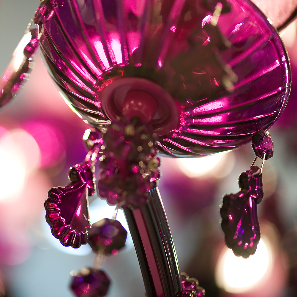
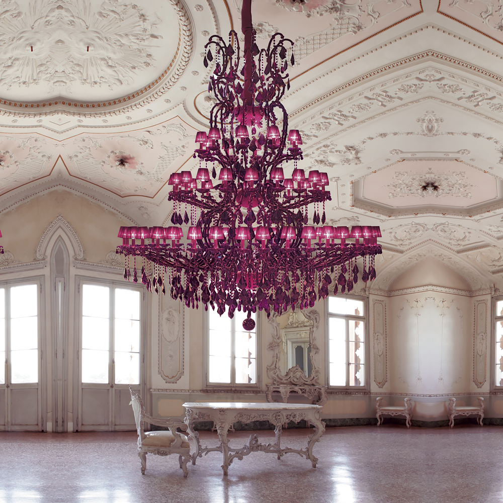
Another great way to pack some drama into your interior with this inspiring shade is through lighting. Pantone recommends “a sculptural Murano glass lighting fixture” for this purpose, such as the chandelier below. A piece like this is guaranteed to steal the show in any space, embodying the bold spirit of Pantone Magenta.
A Minimalist Take on Viva Magenta
If dramatic interiors aren’t your cup of tea, you may question incorporating such a punchy shade into a minimalistic interior. Have no fear – there are a plethora of ways to do so. “Those who desire a more neutral home can use it as a pop of colour,” says Pantone, adding that “Viva Magenta packs a lot of drama in a small dose.”

Take, for example, this wall light featuring subtle magenta glass accents. The tone is still very much present, but doesn’t overpower the room with bursts of colour. This makes for a classy, understated look. While the wall light itself is certainly eclectic, when paired with a mostly neutral space, it will add just the touch of elevation you need without compromising your minimalist aesthetic.
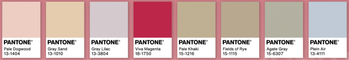
Furthermore, a colour palette has been released that complements the Pantone Colour of the Year 2023. This year’s palette features a variety of neutral shades that pair beautifully with Viva Magenta to create a tasteful interior.
And when all else fails – flowers! There are so many beautiful magenta flowers out there readily available to us, it’s almost criminal not to utilise them. With Viva Magenta being so deeply tied to nature, it’s always a great idea to embrace nature in your home.
-
Exclusive Silver Leaf Mirror£6,398.00