Last week, we took a deep dive into the not-so-new pink and green interior design trend simply to find out why it works. And it got us thinking further about the remarkable role colour can play in shaping our living spaces. The hues we choose for our homes do more than just look good; they possess the ability to influence our emotions and perceptions. In fact, colour often determines how we react to–or even behave in–a space, making it one of the most important tools in interior design. However, in order to wield this power properly, we must first be able to understand colour psychology. In this blog post, we’ll be exploring the various shades and their effects on our feelings and moods to help you find the perfect tone for your home.
Passionate Red – Energy and Romance
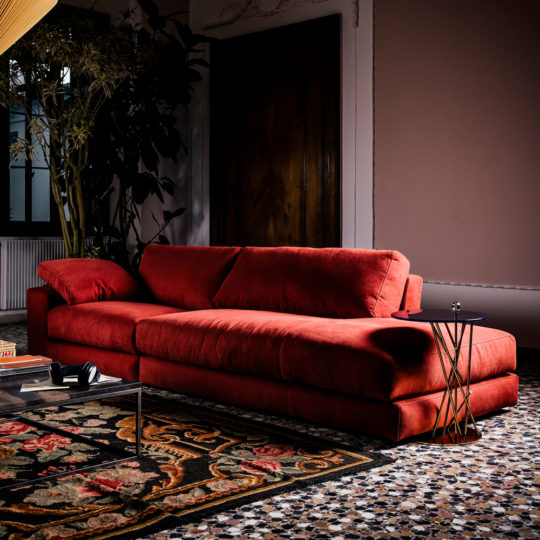
In colour psychology, red is inherently powerful, representing passion, energy, and intensity. When incorporated into interior design, it creates a sense of excitement and liveliness, demanding the viewer’s full attention. Though it’s for this very reason that red is best used in moderation as an accent colour. For instance, a statement sofa, or striking chandelier against a neutral backdrop. This will provide a dramatic contrast to invigorate your space.
-
 Luxury Linen Modular Chaise Style Sofa£16,085.00
 -
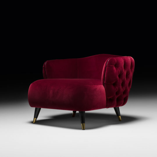
Button Upholstered Designer Velvet Tub chair£10,305.00
Welcoming Orange – Warmth and Comfort
Orange exudes warmth, security, and happiness, which makes it a go-to for getting cosy! Orange permits us to feel safe, so applying this colour psychology to your home can help to create an environment ideal for relaxing. Therefore, it’s most effective in areas of the home where you want to feel most comfortable. And whilst the living area and boudoir might be top of this list, using orange in kitchens and dining rooms can be highly effective. Going back to a much earlier existence, humans were at their most vulnerable when doing things like eating and sleeping. So, selecting this shade for the spaces in which our guard is lowered may just work to soothe those animal instincts!
-
Contemporary Retro Inspired Leather SofaPrice range: £23,969.00 through £24,261.00
-
Contemporary Occasional Chair£6,658.00

Uplifting Yellow – Hope and Creativity
The colour of sunshine, yellow can instantly brighten and lift the mood in any room. In colour psychology, it’s believed to evoke feelings of hope, confidence, and creativity. This makes it particularly perfect for places where you seek inspiration. Adding a splash of yellow to your home office, boardroom or studio can help to stimulate innovation and productivity. After all, there’s a reason they’re called “bright ideas”!
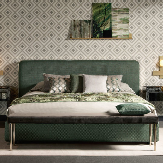
Refreshing Green – Peace and Connection to Nature
Green is often used in biophilic design, a concept that allows us to feel connected with the natural world. In recent years, green has climbed its way to the top of the interior trends list as we become ever-more environmentally conscious. A colour of peace, optimism and refreshment, it effortlessly brings a sense of nature indoors. And studies suggest that doing so can reduce stress, improve mood, and even boost cognitive function. From furniture to houseplants, applying green colour psychology to your home will not only enhance its style, but your wellbeing, also.
-
Contemporary Curved Upholstered BedPrice range: £14,562.00 through £18,461.00
-
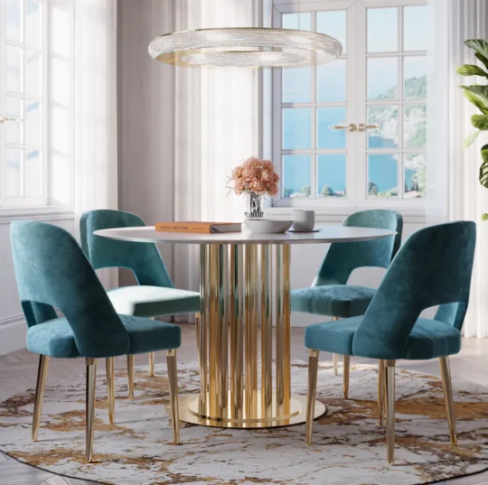
Round Marble Dining Table And Chairs Set£20,045.00

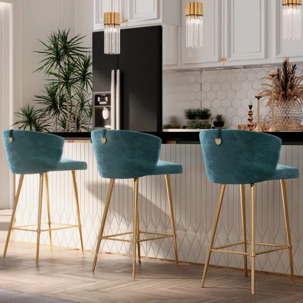
Calming Blue – Stability and Relaxation
Blue is renowned for its soothing properties, making it ideal for spaces where tranquillity is paramount. Instinctively, we view blue as a non-threatening colour. Instead, we associate it with clear skies and bodies of water, both of which have a naturally calming influence. According to colour psychology, blue interiors are believed to reduce stress and anxiety. This is because blue is a short-wavelength colour, meaning it’s capable of triggering a hormonal response and thus altering our emotional state. In fact, being around blue can reduce both heart rate and blood pressure. Consequently, incorporating varying shades of blue in your home, from soft pastels to teal tones to deep navy, will help to create a space that promotes peace of mind.
-
Contemporary Teal Velvet Bar Stool£3,963.00
-
Large Contemporary Pleated Corner Sofa£42,957.00

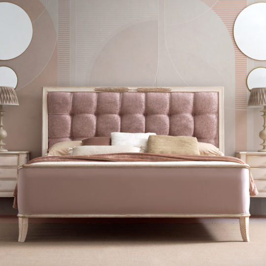
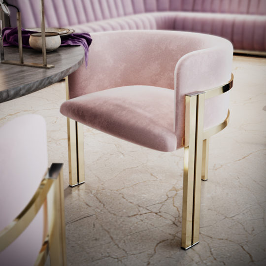
Playful Pink – Playfulness and Nostalgia
Pink can be a much softer shade than most, which means it too is ideal for bedrooms and living areas. Colour psychology suggests pink is often reminiscent of childhoods and eras past, meaning this playful and nostalgic shade is perfect for adding a touch of whimsy and charm to your home. From art deco to mid-century to 1980s chic, pink has remained a popular interior design choice throughout history, proving it will never fall out of fashion time and time again. So, what better way to introduce such a timeless tone to your home than with retro revival style furniture?
-
Feather Design Button Upholstered Sleigh Bed£16,028.00
-
Contemporary Curved Dining Chair£3,870.00
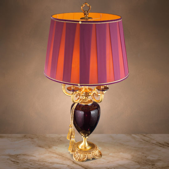
Enigmatic Purple – Mystery and Opulence
Purple is a unique and enigmatic colour associated with mystery, nobility and wisdom. This is due to its rarity in nature, making it long coveted by many–particularly amongst royalty and religions. Therefore, applying colour psychology in the form of purple will bring a sense of luxury and sophistication to any room. Try mixing up shades using both accessories and statement pieces for an elegant and refined look.
When it comes to interior design, colour plays a crucial role in setting the tone and ambience of a space. Each hue has its unique qualities, enabling them to bring forth specific emotions and moods. By understanding colour psychology and the impact different shades can have, you can curate a harmonious and inviting environment that resonates with your personality whilst enhancing your wellbeing. So, if you’re thinking about redecorating, consider the power of colour and the transformative effect it can have on your living space. You should also explore our comprehensive guide to colour theory for interior design.
We’re Here to Help
Get in touch to find out more about our award-winning luxury interior design service.
If you need help choosing your luxury furniture, our design team is always on hand. For advice on sizes, colours, fabrics and finishes, or to design the perfect space for you, contact us.
Hello,
My name is Zaina Bernardo and I am a year 13 student studying A-Levels at Chestnut Grove Academy in Balham. For one of my A-Levels (Design and Technology) I have to design and manufacture a piece of furniture to solve a problem of my choice; I chose to solve the problem of lack of multifunctionality in sensory room furniture. For my coursework, I am currently doing research into colour psychology and different sizes, colours, fabrics and finishes that will be the best fit for children with autism.
I was wondering if you have any extra information which would help me to achieve the most marks in the research section of my coursework as it is 50% of my Design and Technology final grade. Anything would help!
Thank you,
Zaina Bernardo
HI Zaina I would strongly suggest using AI tools to offer inspiration and design ideas for your project. I hope this helps. If you need help in getting going with AI let us know and ask for Juliette.