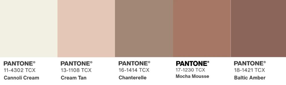
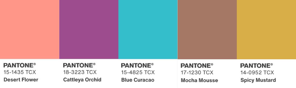
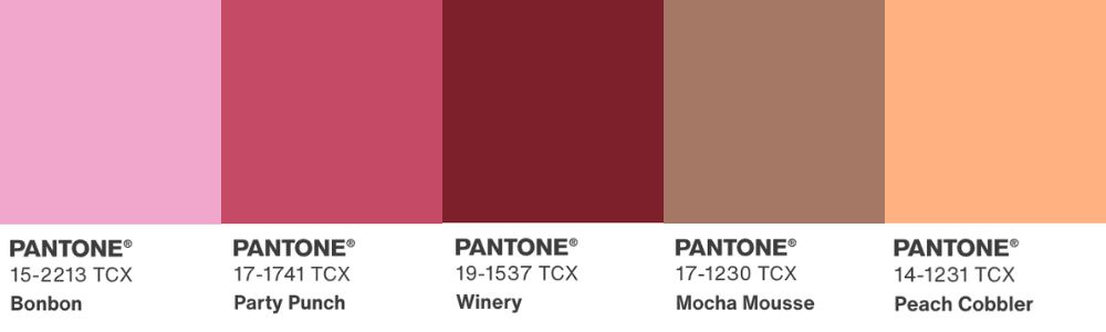
What began as a means to mark the millennium has become something much more celebrated. Now entering its 26th year, we’re, of course, talking about Pantone’s Colour of the Year. Described by Pantone’s President, Elley Cheng as “a reflection of the moment we’re living in”, their Colour of the Year holds up a mirror to current moods, trends and experiences. At Juliettes Interiors, we’re celebrating Pantone’s Colour of the Year 2025: Mocha Mousse. It shares some of the warmth of last year’s pick, Peach Fuzz, but swaps out the freshness for a sophisticated layer of luxury and indulgence that will work wonderfully in any home.

What is Mocha Mousse?
Laurie Pressman, Pantone’s Vice President, paints a delicious picture of Mocha Mousse as “a flavourful brown, expressing a level of thoughtful indulgence. Evoking a sensory experience that goes beyond the visual.”
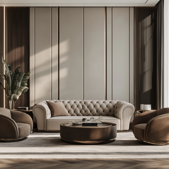
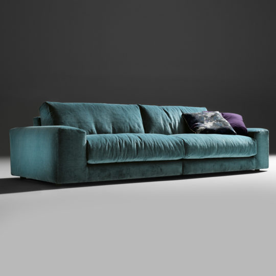
We think this shade oozes comfort, especially when incorporated into soft furnishings, like sofas, beds, occasional seating and accent chairs.
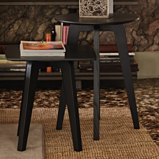
It encourages thoughts of nature and the earth; a feeling that can be amplified when paired with natural wood side tables that sit beside windows overlooking green spaces.
-
 Contemporary Mocha Ash Side TablePrice range: £1,999.00 through £2,005.00
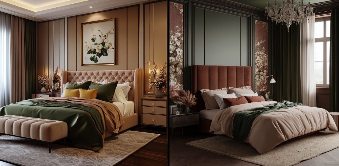
Mocha Mousse is soft, yet sophisticated, reminding us of life’s little pleasures – our minds drift to coffee and chocolate!
It appeals to our increasing desire to bring balance to our fast-paced lives. Adding Mocha Mousse to your home encourages enjoyment and escapism. Begging you to put down technology and pick up your favourite hot drink.
The Mocha Mousse Mood
Mocha Mousse: “sophisticated and lush, yet at the same time an unpretentious classic” (Leatrice Eiseman, Executive Director Pantone Color Institute).
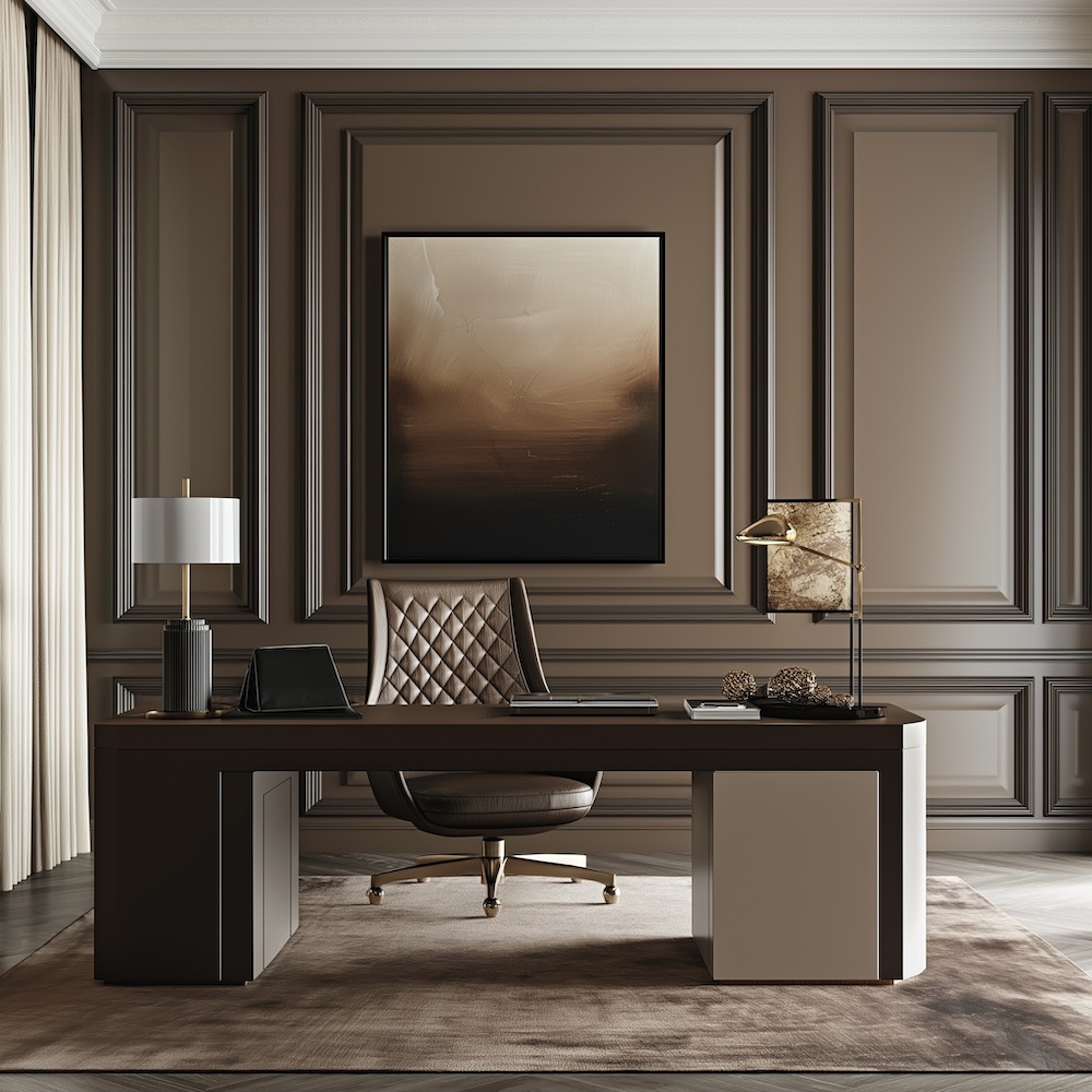
Its organic feel promotes positive wellbeing, connecting you to nature and encouraging you to pause. Incorporating Mocha Mousse into home office spaces. Blending with rich veneer or natural wood desks and plush leather nubuck office chairs. Can bring a sense of calm – even more so if partnered with plants and tones that remind you of the outdoors.
-
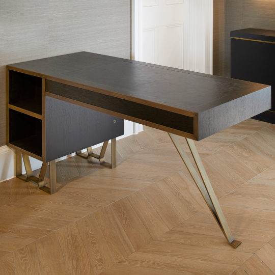
Modern Industrial Style Oak Veneer DeskPrice range: £6,206.04 through £19,336.00
-
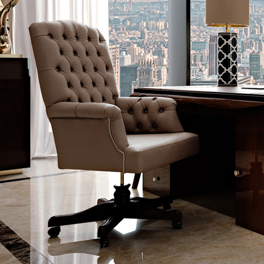
High End Italian Leather Swivel Office Chair£7,466.04
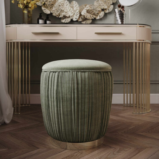
You can’t help but feel comforted and content as you imagine the sweet treats and delights echoed in this chocolatey brown. Adding it to your relaxing spaces, like a decadent leather chaise longue in your living room is guaranteed to encourage harmony. As it welcomes you like a warm hug. Or a rich velvet dressing table stool in your bedroom for those quiet moments of solitude before heading to bed.
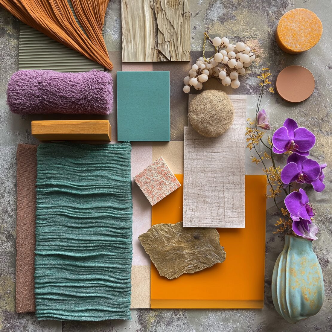
Pairing Mocha Mousse with Other Colours
A versatile shade, Mocha Mousse is a glamorous choice as a base colour for minimal or rich designs. Alternatively, it can be used to accent a room with tone, texture and materials.
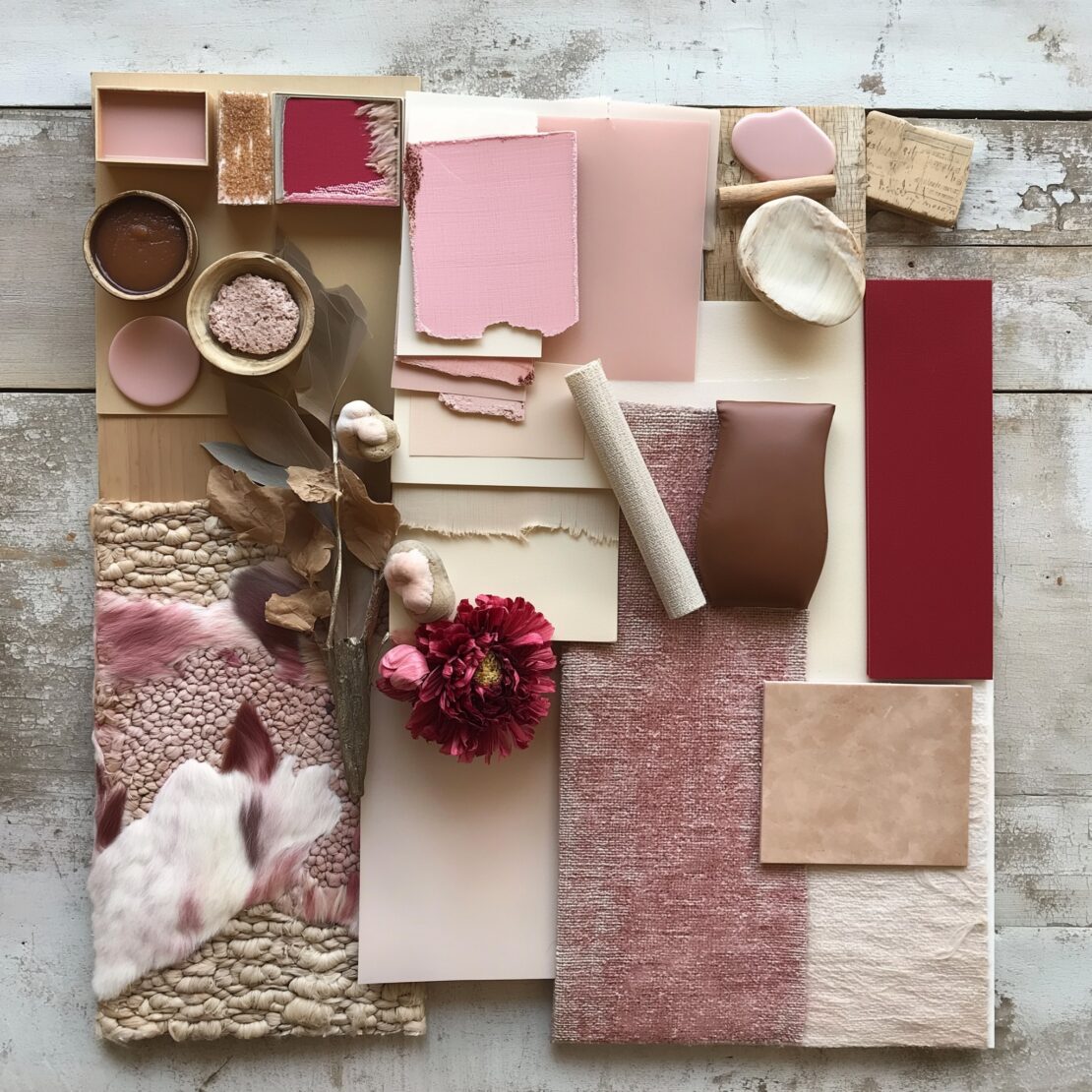
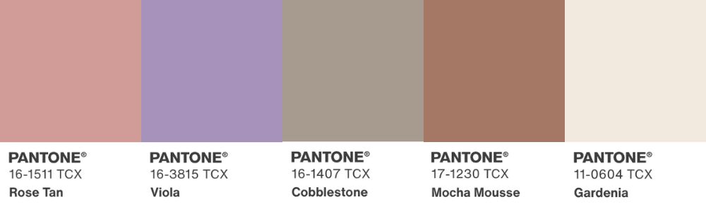
We’ve drawn on Pantone’s five Mocha Mousse colour palettes as inspiration – they vary in look and feel. Demonstrating what a universal shade this Colour of the Year is.
Neutral Lovers
This shade blends seamlessly with your creams, tan and warm neutrals. Making it easy to add to existing designs using a muted colour scheme.
Anyone after a feeling of zen should explore ‘Relaxed Elegance’, which is spa-like in its mood, pairing Mocha Mousse with other browns, beiges, creams and taupes, promising to inspire positive wellbeing and comfort.
Subtle Contrasts
The more muted ‘Subtle Contrasts’ partners refined browns with classic and compatible blues and greys for an elegant feel, pairing well with deep rich gold accents.

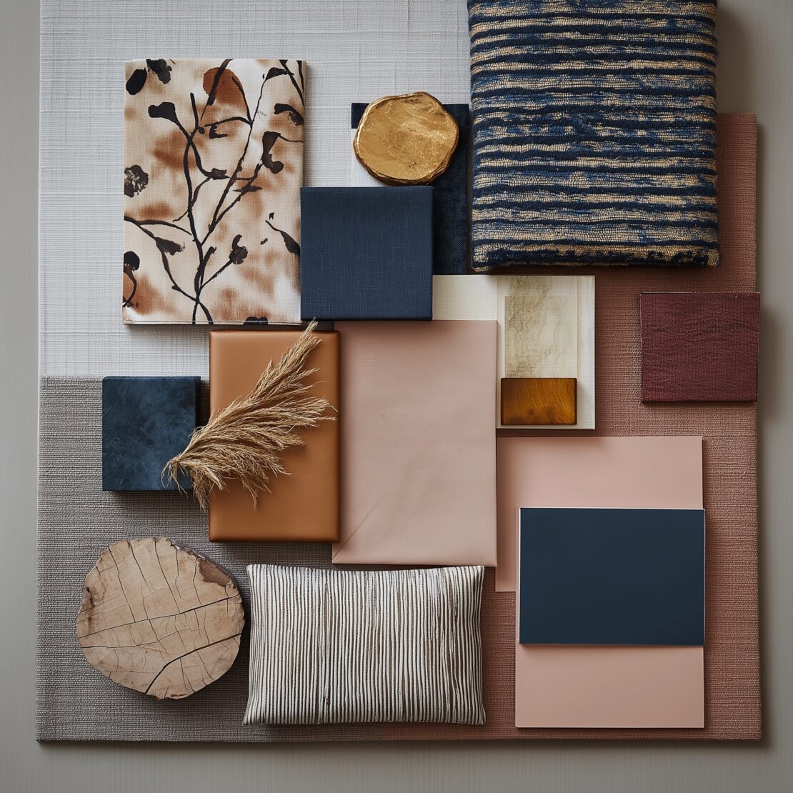
Colour Lovers
Those drawn to bolder tones will prefer ‘Uniquely Balanced’, which uses Mocha Mousse to calm a more exotic mix of vibrant tones.
-
Contemporary Winged Occasional Armchair£3,770.04
-
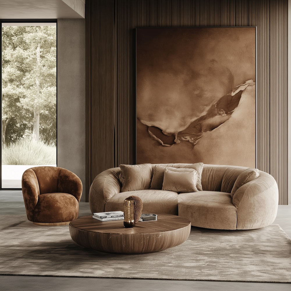
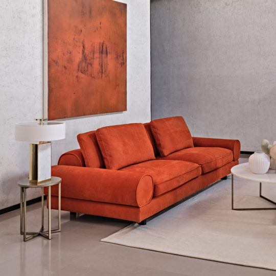
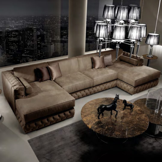
Luxury Large Velvet Modular Sofa£16,820.04
-
Contemporary Retro Inspired Leather SofaPrice range: £23,969.00 through £24,261.00
-
Italian Button Upholstered Velvet Dining ChairCall For Price
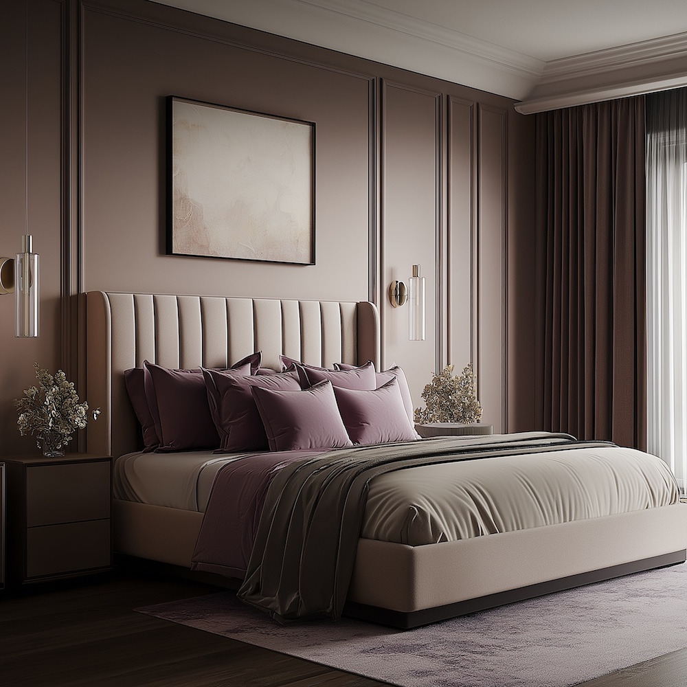
Delectably Delicious
For a more sensory experience, ‘Deliciousness’ is inspired by confectionery and is dripping with playful elegance – you can practically taste the sweet treats!
-
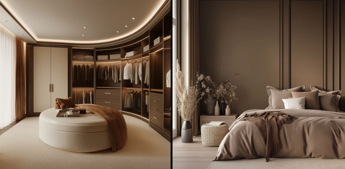
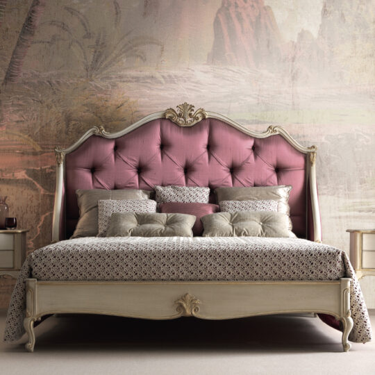
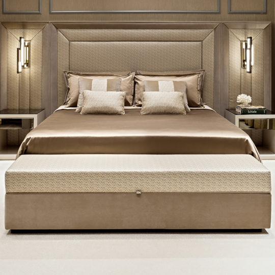
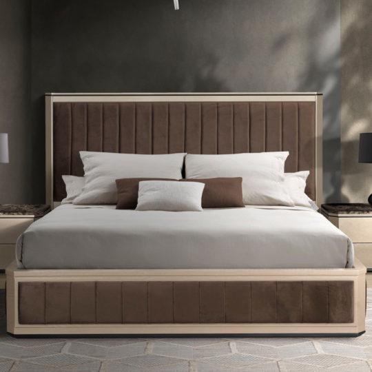
Ornate Classic Style Winged Bed£15,028.00
-
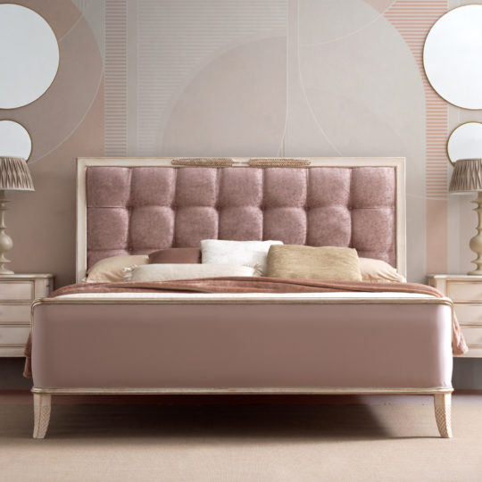
Feather Design Button Upholstered Sleigh Bed£16,028.00
-
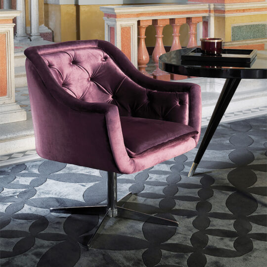
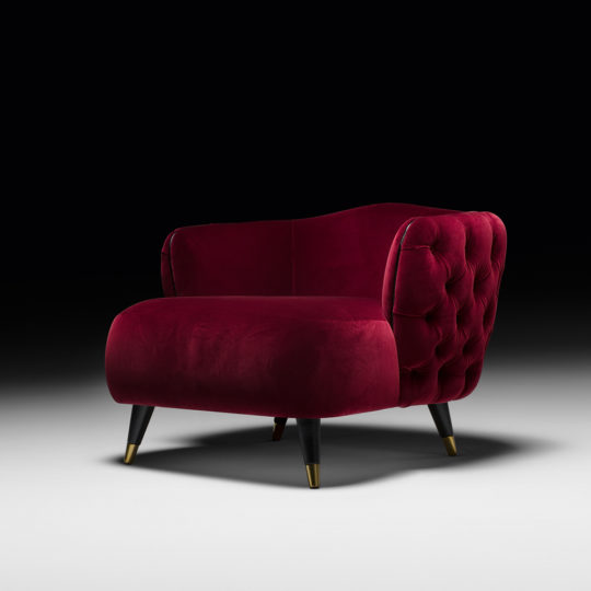
Button Upholstered Designer Velvet Tub chair£10,305.00
Garden Florals
Alternatively, ‘Floral Pathways’ draws on nature, reflecting the feel of walking through a springtime garden by blending fresh floral tones of rose, green, and viola with a creamy Mocha Mousse.

-
Velvet Pouffe With Gold Plated Base£1,507.00
-
Italian Designer High End Bed With Twisted Leather HeadboardPrice range: £18,549.00 through £20,498.04
-
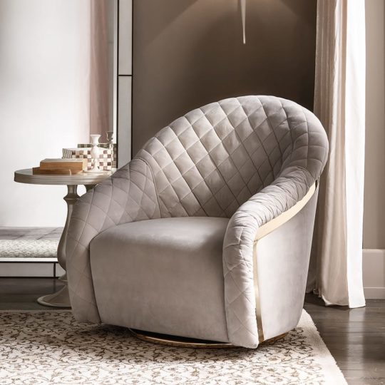
Modern Italian Designer Quilted Leather Swivel Armchair£14,669.00
-
Italian Designer Upholstered Ottoman Style Storage BenchCall For Price

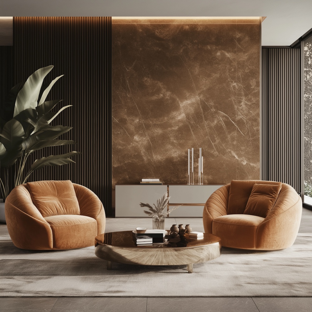
How to welcome Mocha Mousse into your home
“Mocha Mousse presents a discreet and tasteful touch of glamour” (Laurie Pressman, Pantone’s Vice President).
This beautiful brown lends itself to furniture, so it can easily be incorporated into your home.
Blur the lines between indoor and outdoor living by pairing light spaces with soft brown furnishings, like sofas and armchairs, that beg for you to take a moment with a coffee before a busy day and unwind with a mug of cocoa before bed.
-
Contemporary High End Modular Corner Sofa£30,776.00

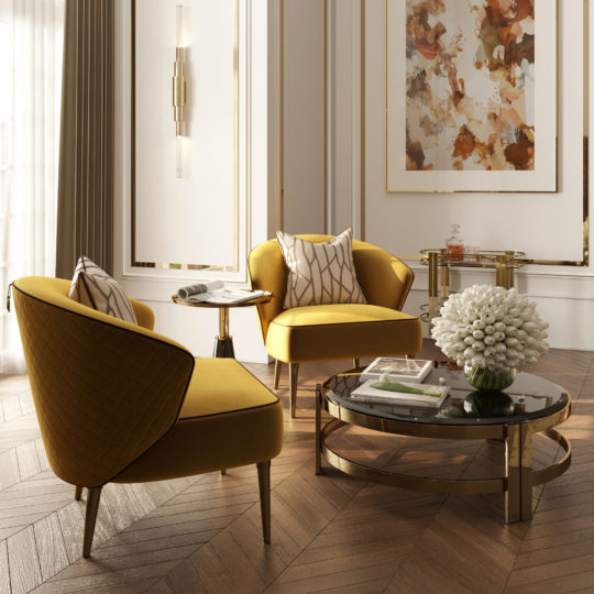
For a more luxurious feel, Mocha Mousse promises to promote elegance when used in rooms with darker colour palettes.
-
Chic Contemporary Upholstered Bed£6,646.00
-
Large Italian Nubuck Leather Modular SofaPrice range: £34,399.00 through £46,785.00
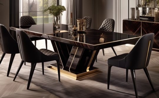
This shade is also perfect for bringing a touch of sophistication to any space, whether that’s a grand hall or a small bijoux space. It’s versatile for almost every room from the boardroom, to the bedroom or your bar!
-
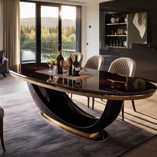
Exclusive Oval Designer Dining SetPrice range: £4,200.00 through £63,000.00
-
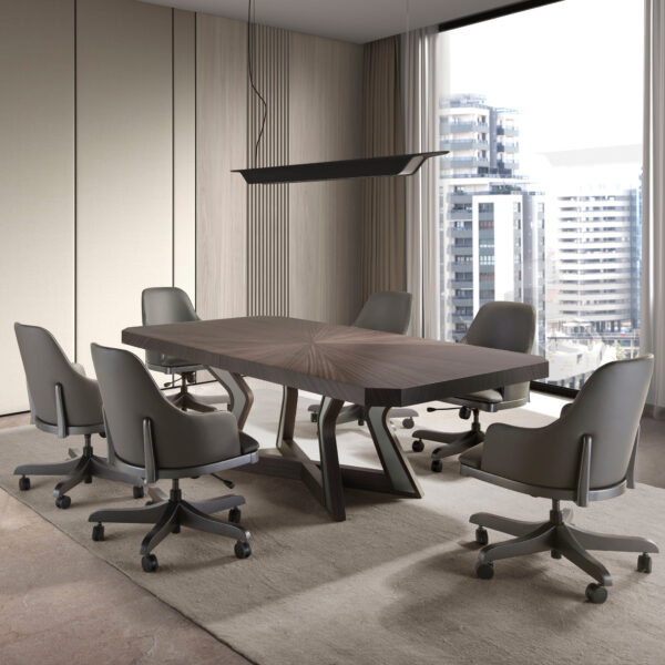
Luxury Veneered Boardroom TablePrice range: £7,571.00 through £8,638.00
-
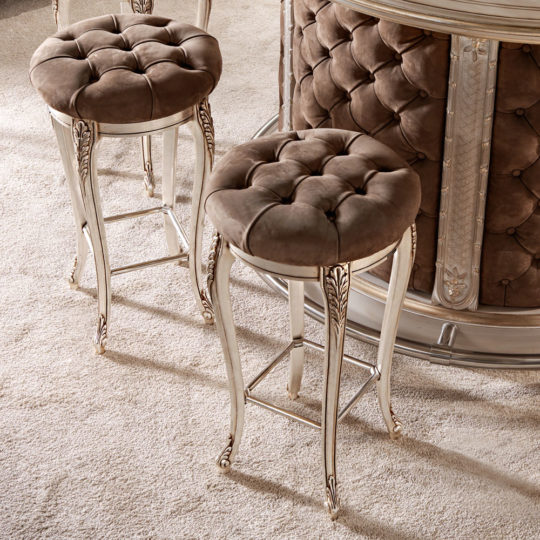
Luxury Italian Bar StoolPrice range: £3,862.00 through £4,097.04
-
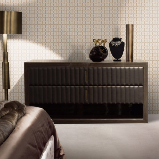
Designer Italian Leather And Walnut Veneer Chest Of Drawers£10,765.00
Customise your interiors for a home like no other
Feeling as inspired as we are by the ways Mocha Mousse can add class and elegance to your home? With Juliettes Interiors you can fully customise all our high-end furniture, allowing you to select the perfect shade, size and material for your space.
Our bespoke furniture design service allows you to create furniture and a space that is uniquely yours. Get in touch with us to discuss customisable options, or to find out more about our award-winning interior design studio.