-
 Large Contemporary Pleated Corner Sofa£42,957.00

If you’ve kept up with interior design trends at all over the past few years, we’re sure you’re familiar with minimalist interior design. This simple design aesthetic has dominated interior trends for a long time now, and its timeless versatility means it won’t be fading into the background any time soon. However, if you’ve read our 2023 interior design trends article, you may have seen that there has been a significant uptick in interest for an eccentric twist on minimalist interiors. Today, we’ll be focusing on one example of that in particular: pops of colour.
Adding pops of colour into a minimalist interior not only elevates the space by adding dimension, it also makes for a great feature talking point. Furthermore, incorporating pops of colour into your interior at this time of year is a great way to liven up the space as we transition from winter to spring. Read on for some inspo on tastefully adding pops of colour into your interior.
Pick an accent colour
A foolproof way to tastefully incorporate a pop of colour into your interior is by sticking to one accent colour. This will liven up the space without overwhelming the senses, making for a cohesive and effortless flow of space throughout the room. Take, for example, the way we’ve styled these pieces from our new Park Lane Collection. The emerald green accents introduce a much-needed pop of vibrancy against the neutral backdrop. Meanwhile, the fact that the accents are all of a matching tone keeps the space chic and classy.
-
Large High End Integrated Wardrobe£51,880.00
-
High End Art Deco Style Dressing TablePrice range: £3,450.00 through £18,820.00

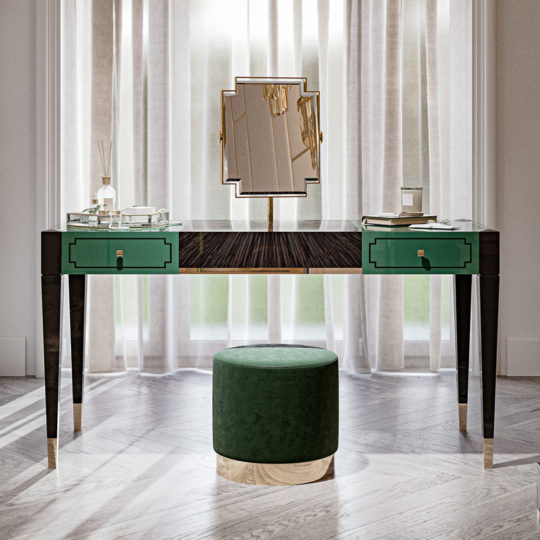
Check out our latest blog here for more inspo on styling the pieces from our exclusive Park Lane Collection.
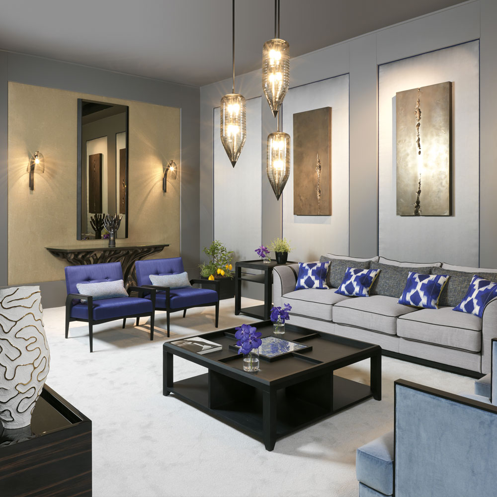
Here’s another example of a tasteful accent colour. The pops of this deep periwinkle shade truly stand out amongst the rest of the room. However, the fact that these pops of colour are dispersed in small doses means that the room isn’t overly crowded.
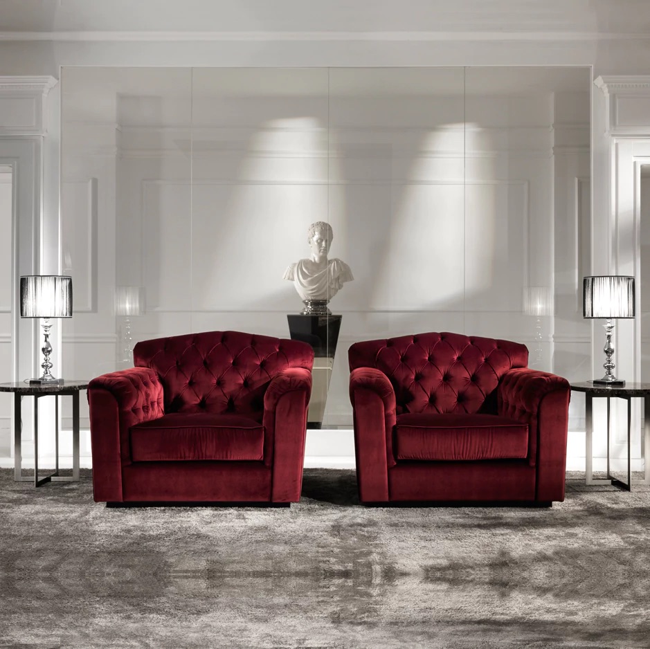
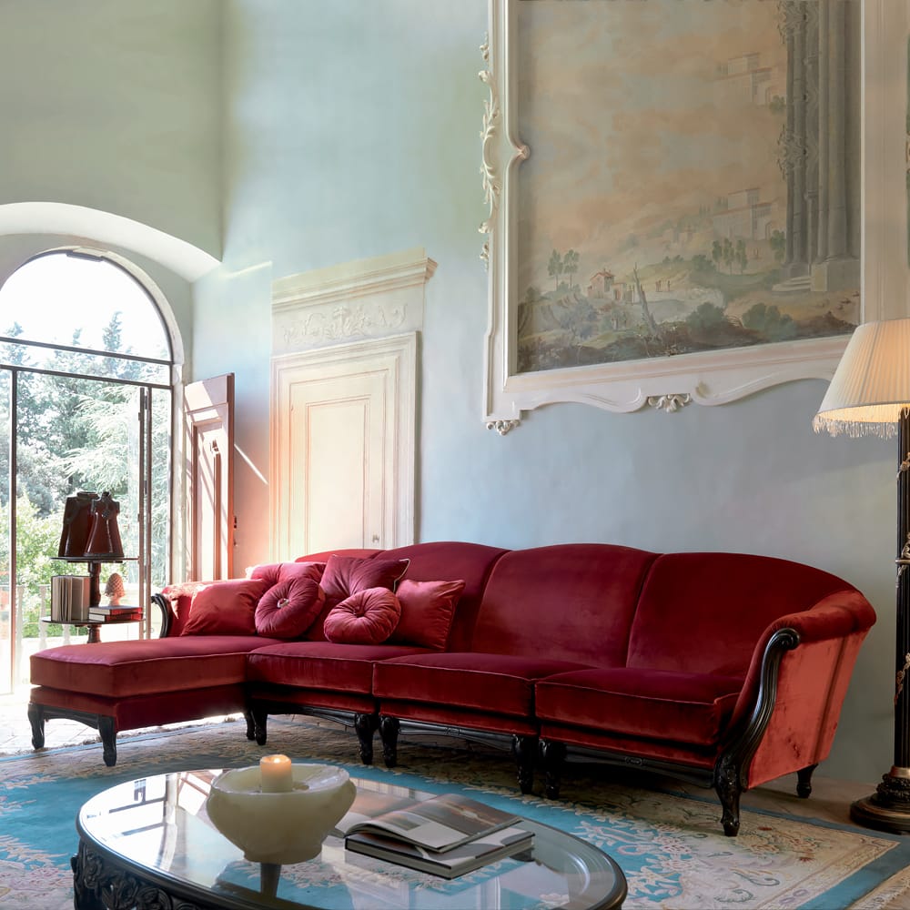
Top tip: Remember that a pop of colour doesn’t necessarily mean a super bright colour. If electric tones that shock the senses aren’t for you, don’t force yourself! When working with a neutral backdrop, any incorporation of colour has the potential to pop. For example, red furniture and decor easily stands out without necessarily needing to be in a bright shade. Furthermore, these deep, sumptuous crimson tones really elevate the opulence of the space.
Statement lighting
If you’d prefer to keep your furniture neutral, opting for a standout light fixture can really pack a big punch. Not only do these lighting structures offer intricate designs that are sure to bring a unique and eclectic feel to your interior, they also come in a range of show-stopping tones that can be customised to your liking.
Whether it’s a mere table lamp or an opulent chandelier, colourful statement lighting is sure to elevate your interior. Furthermore, they’ll cast a gorgeous and subtle coloured glow against any neutral backdrop when lit up.
Feeling Inspired?
If any of our interior design tips take your interest, we encourage you to contact us for sales or interior design project enquiries. We can help you bring your dream interior to life with our luxury interior design services. We’re passionate about the art of curating interiors, and we pride ourselves on making the entire process seamless for you – from initial consultation right through to final installation. Get in touch today!